
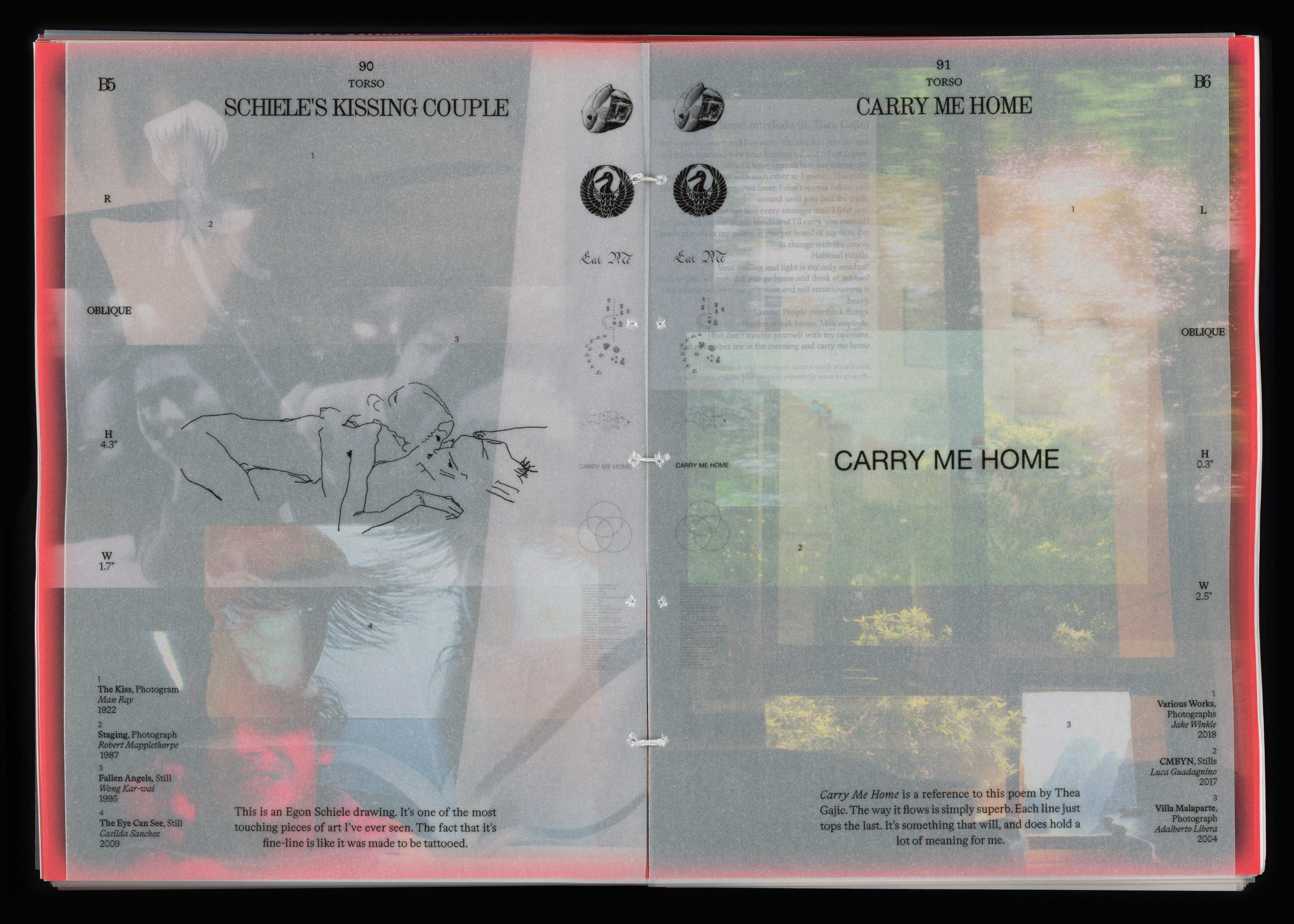
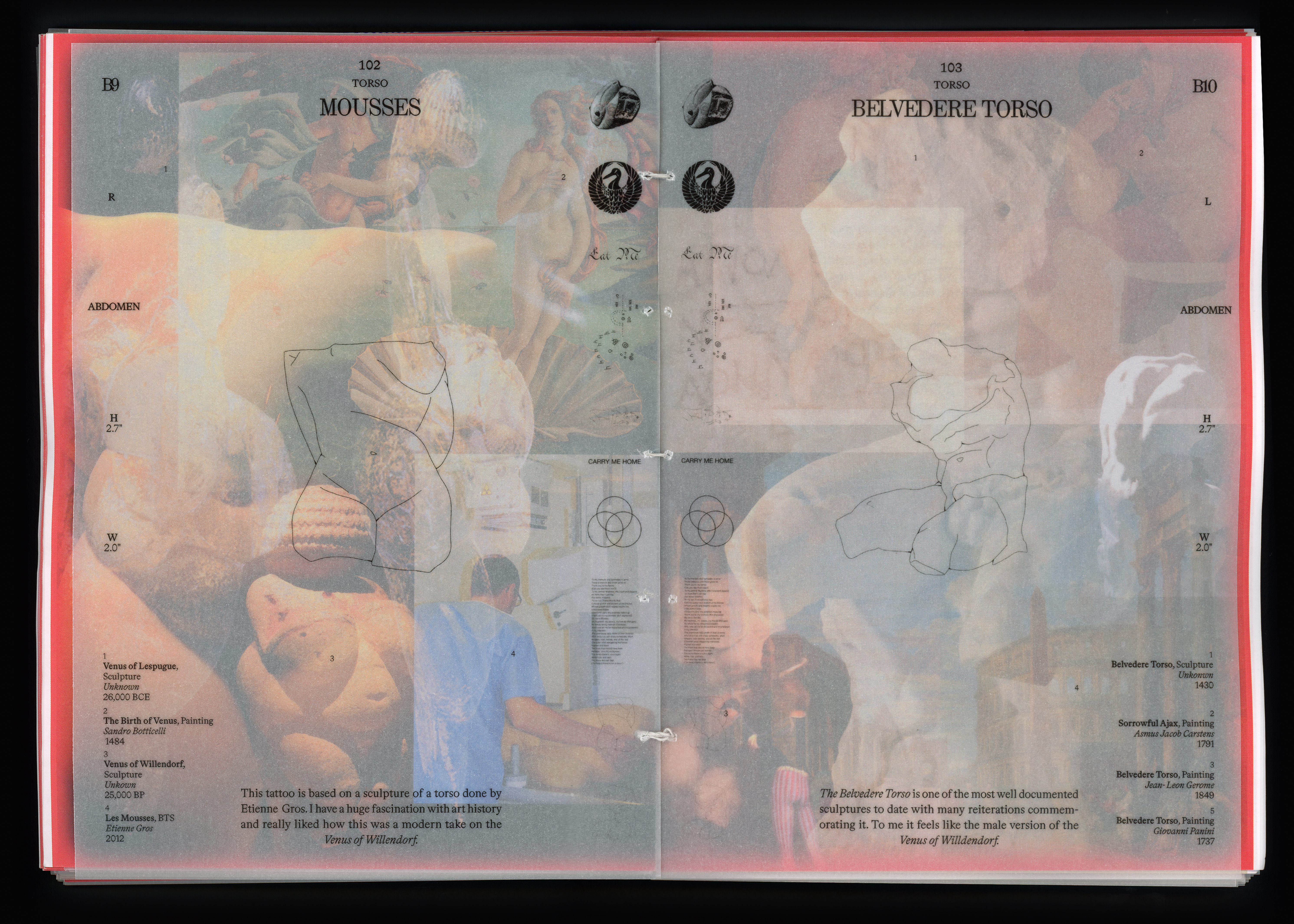
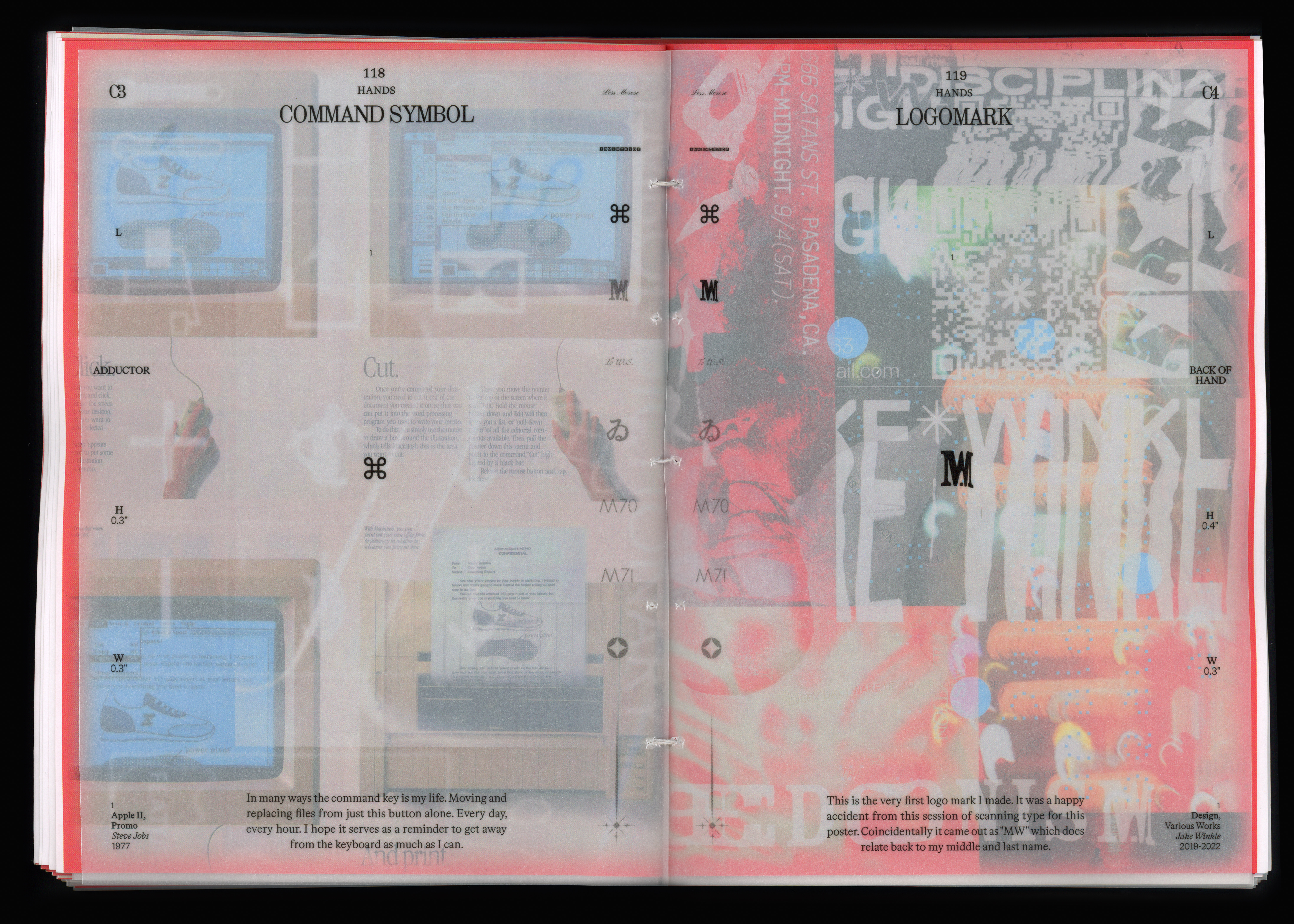
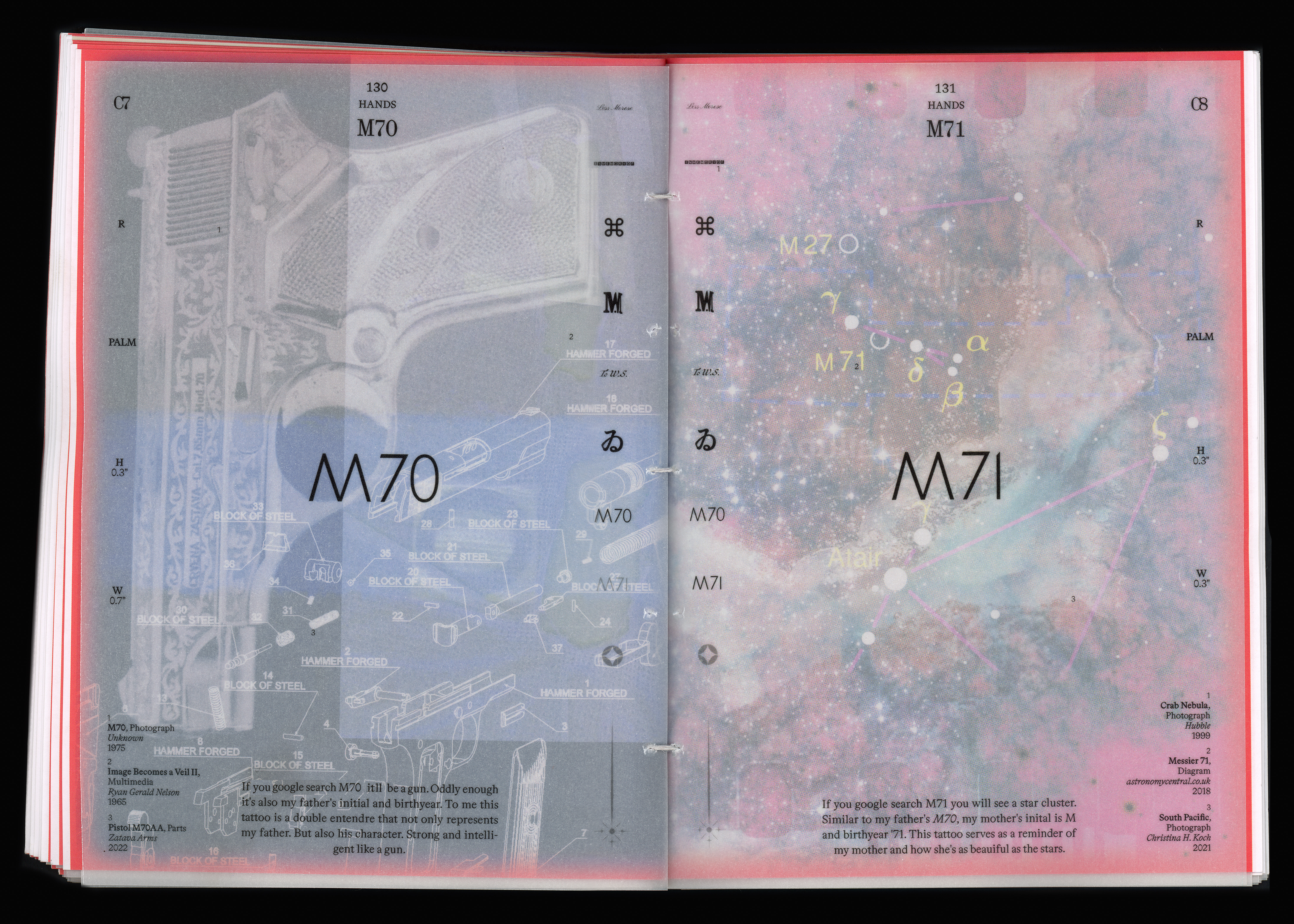
Layers of Mementos
Hand-Stitched Book (240 pages)
60# Uncoated Text + 80# Matte Transparent Paper
6.5 x 9”
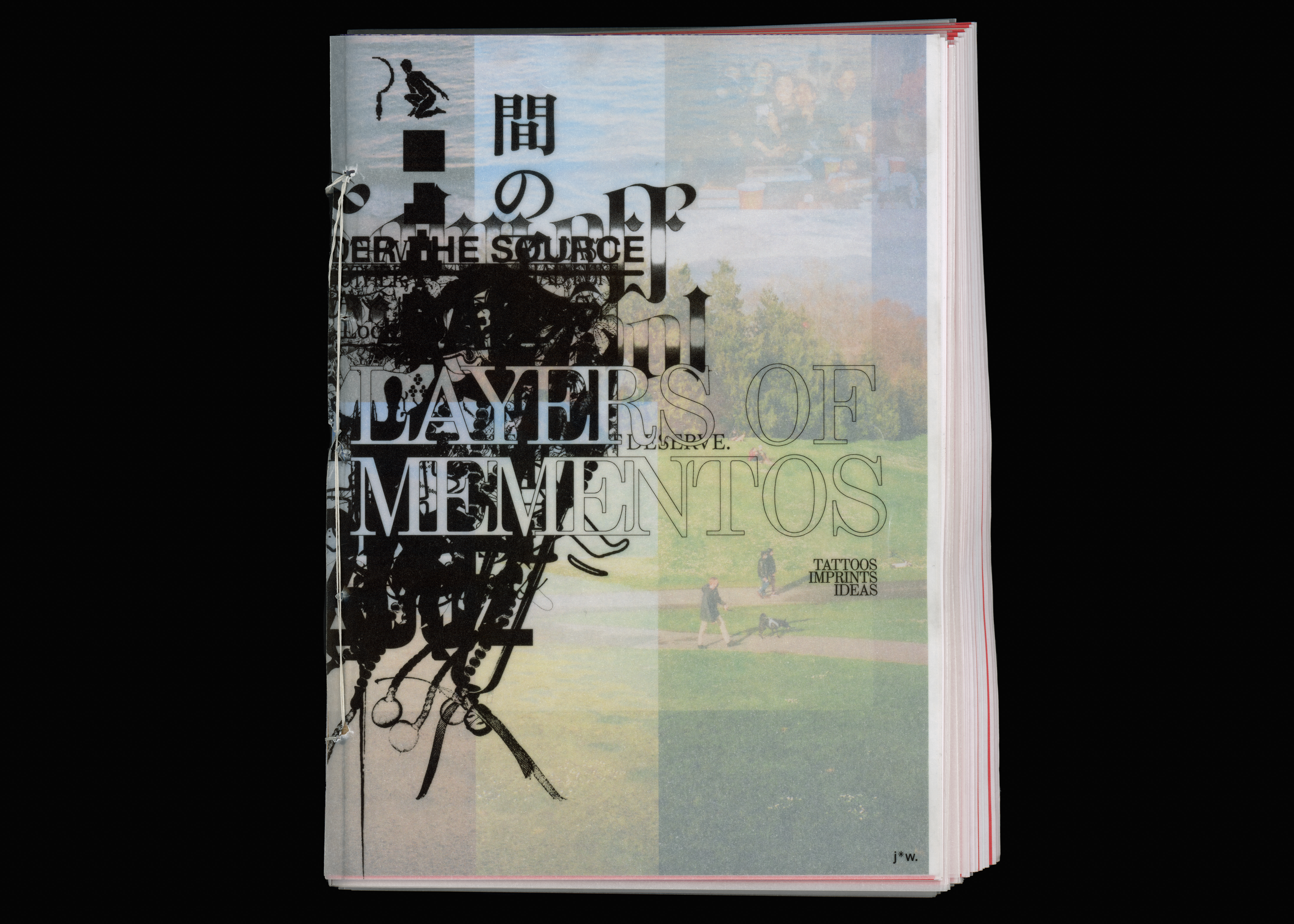
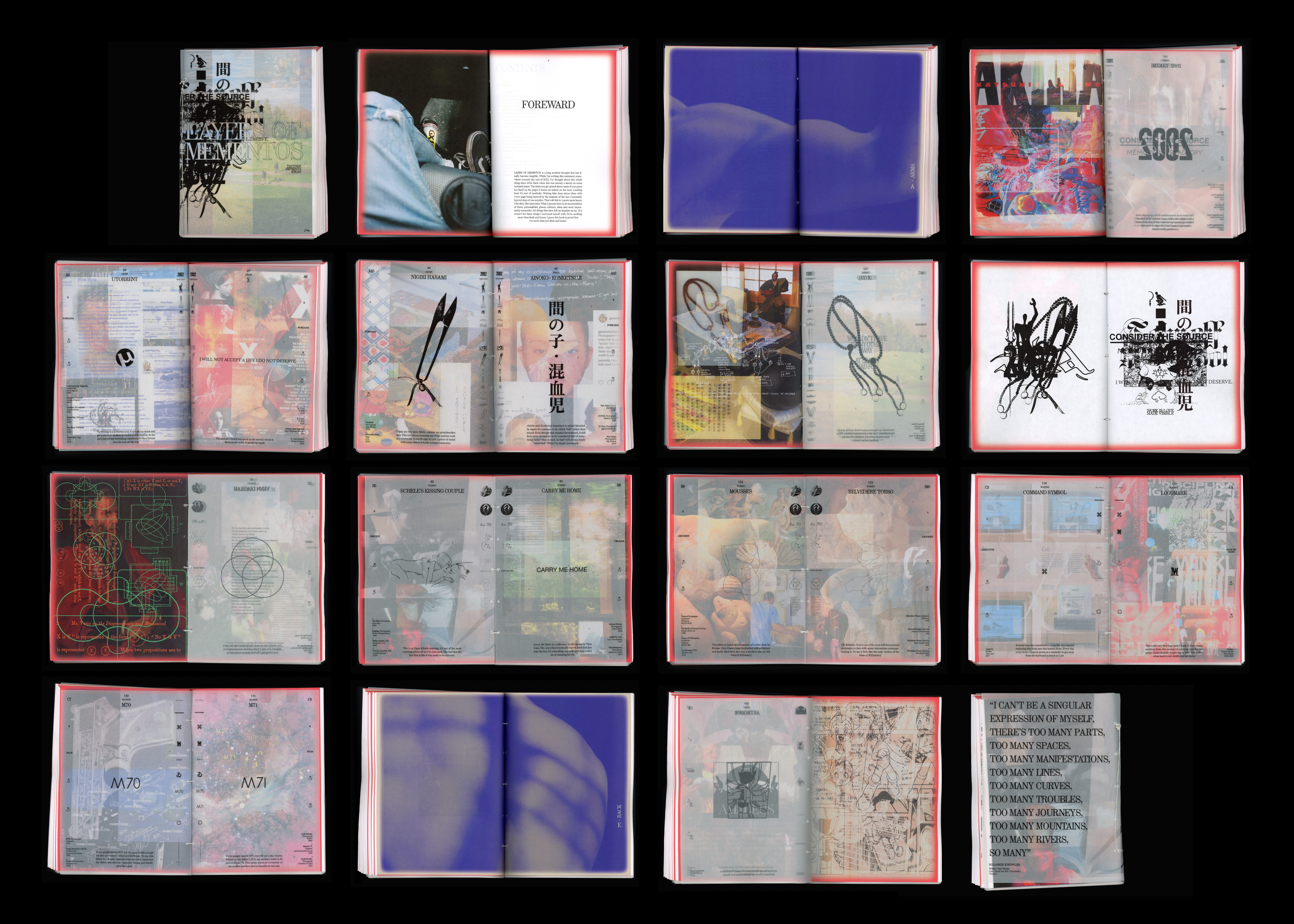
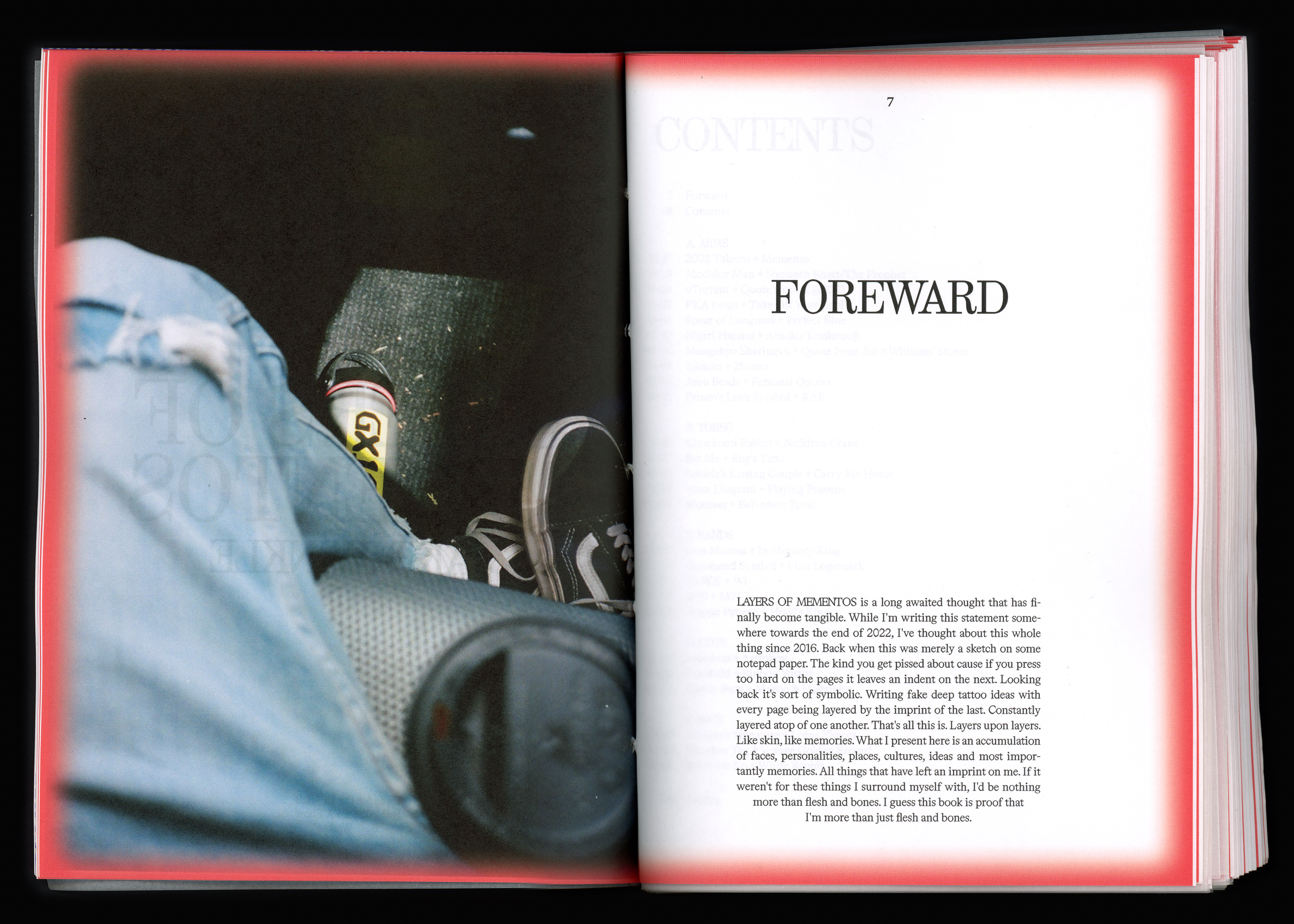
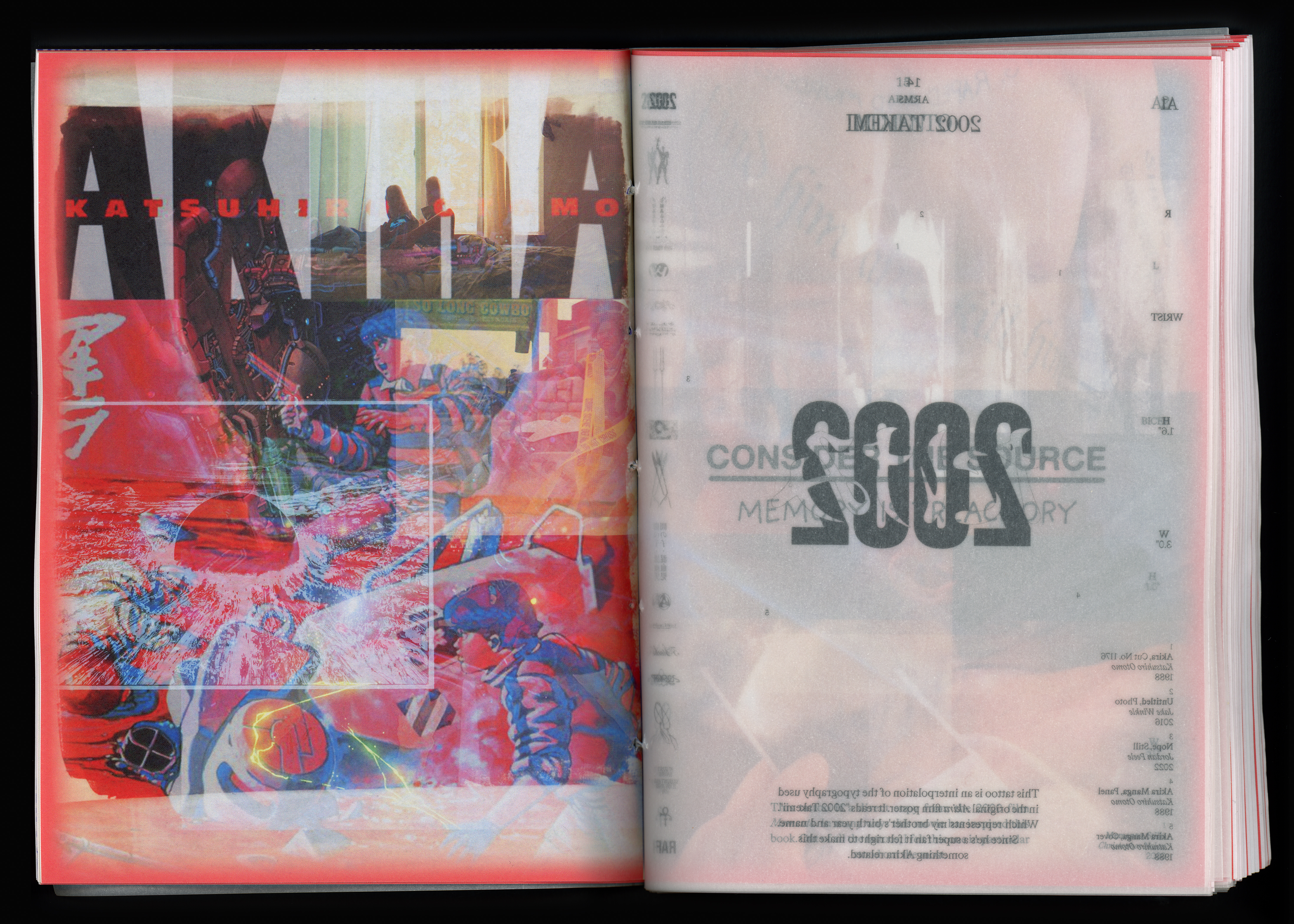
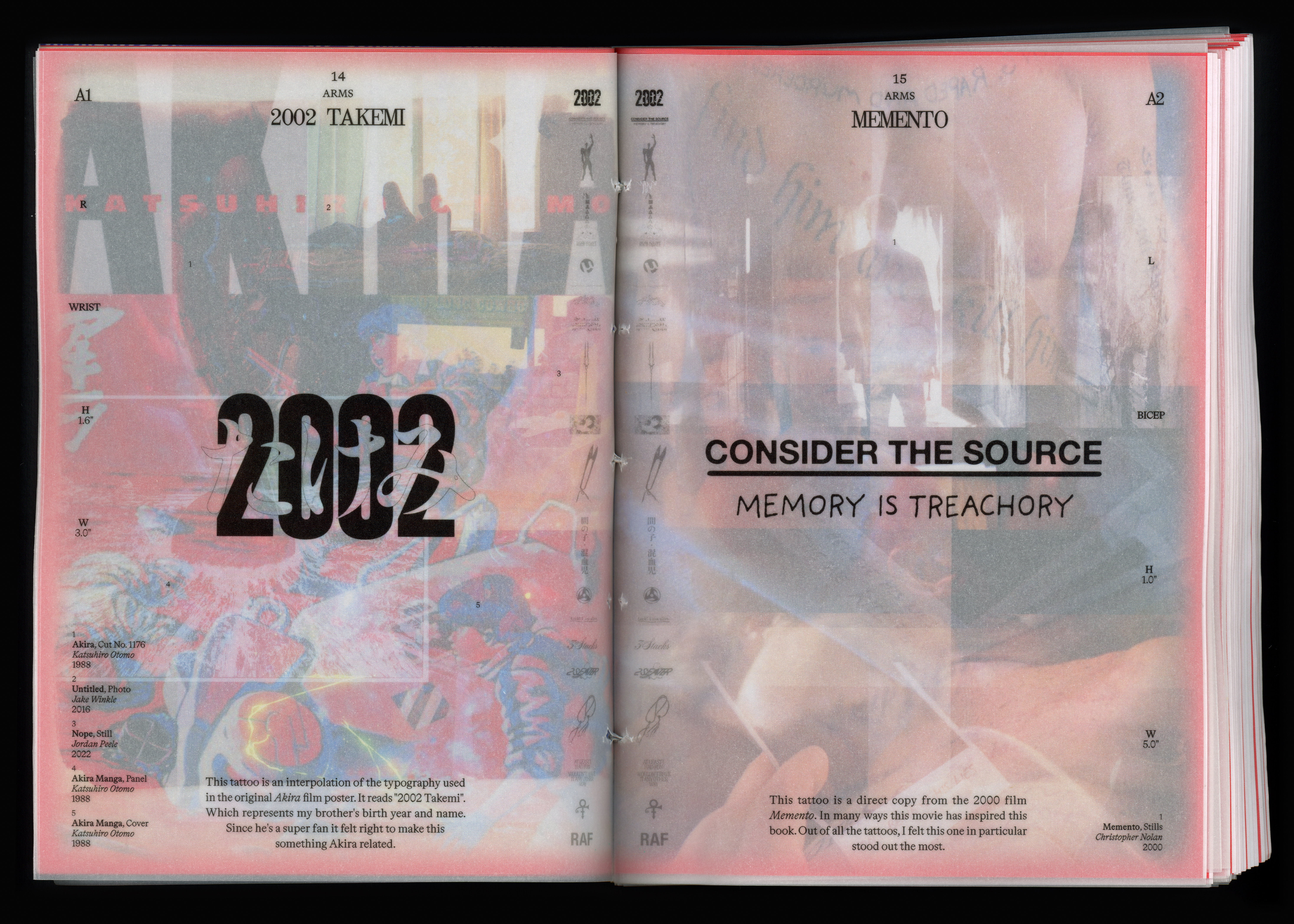
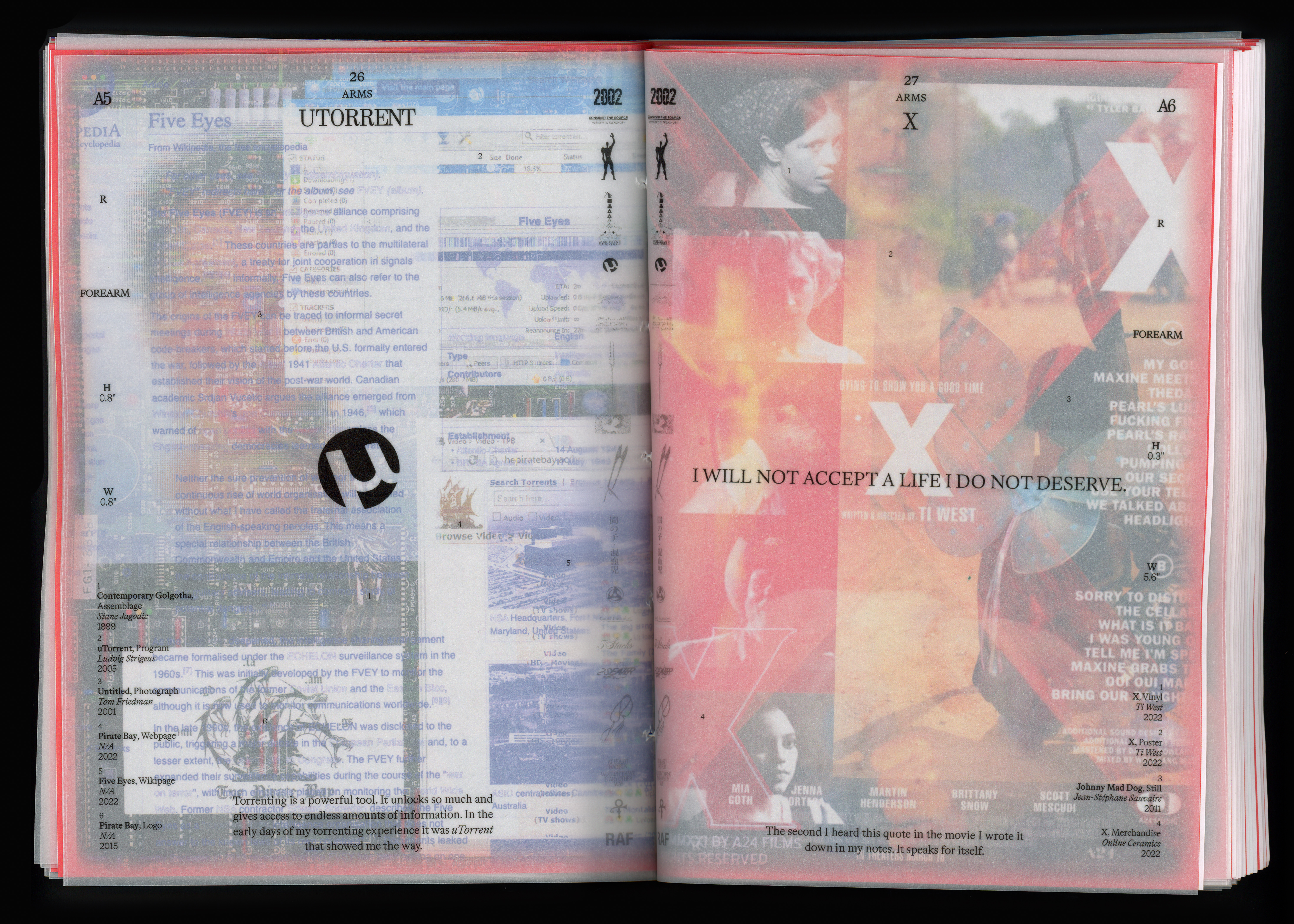
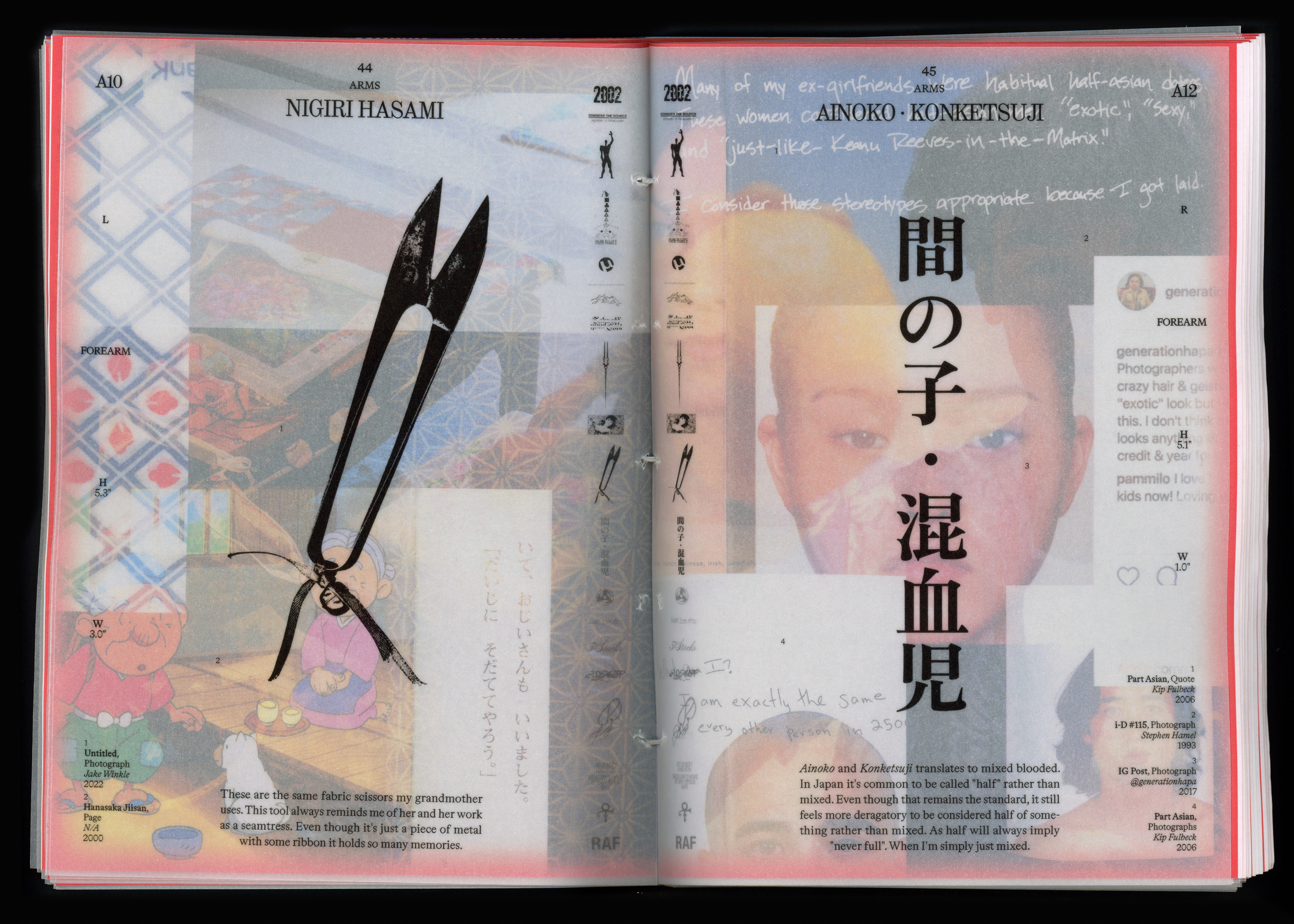
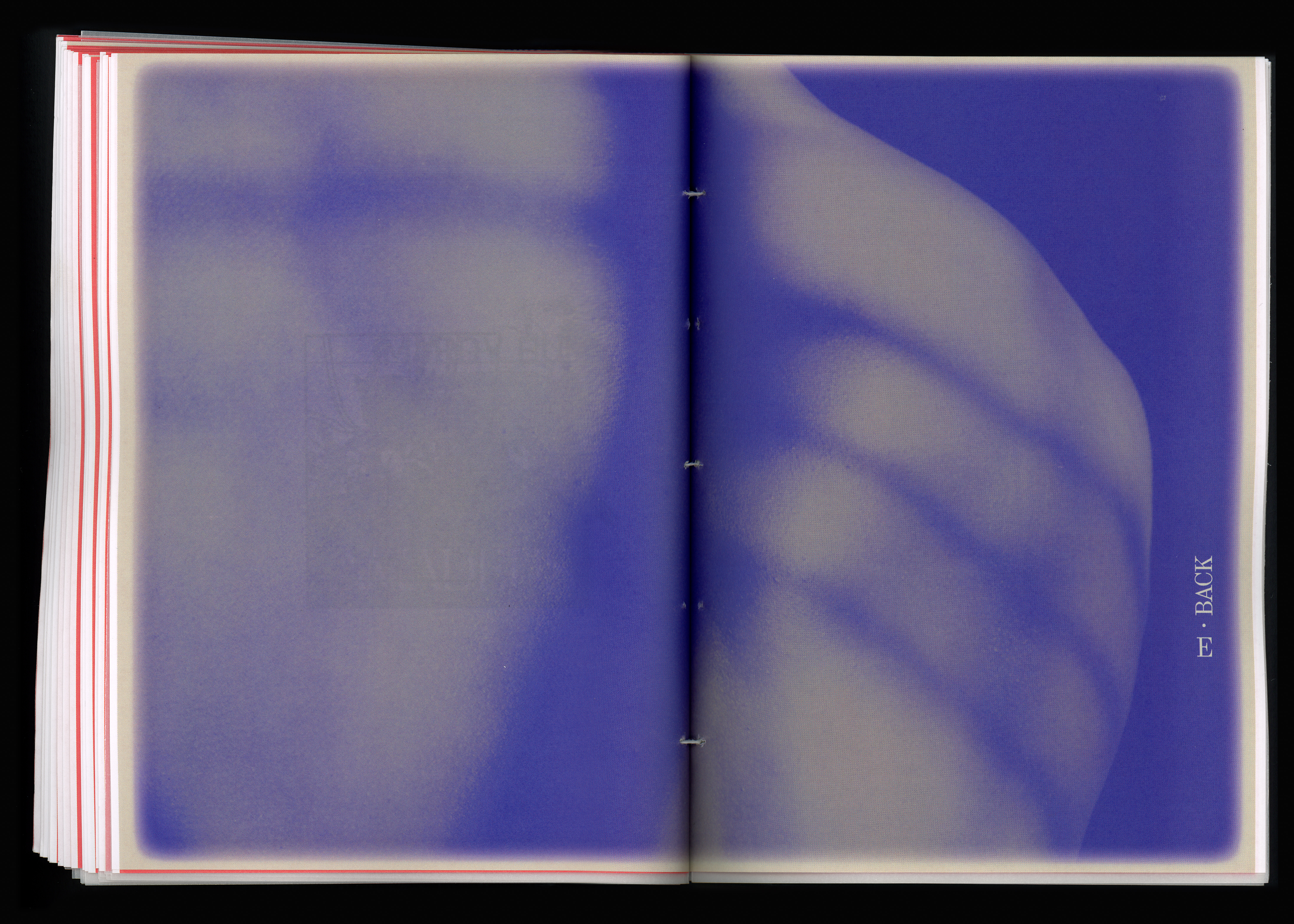
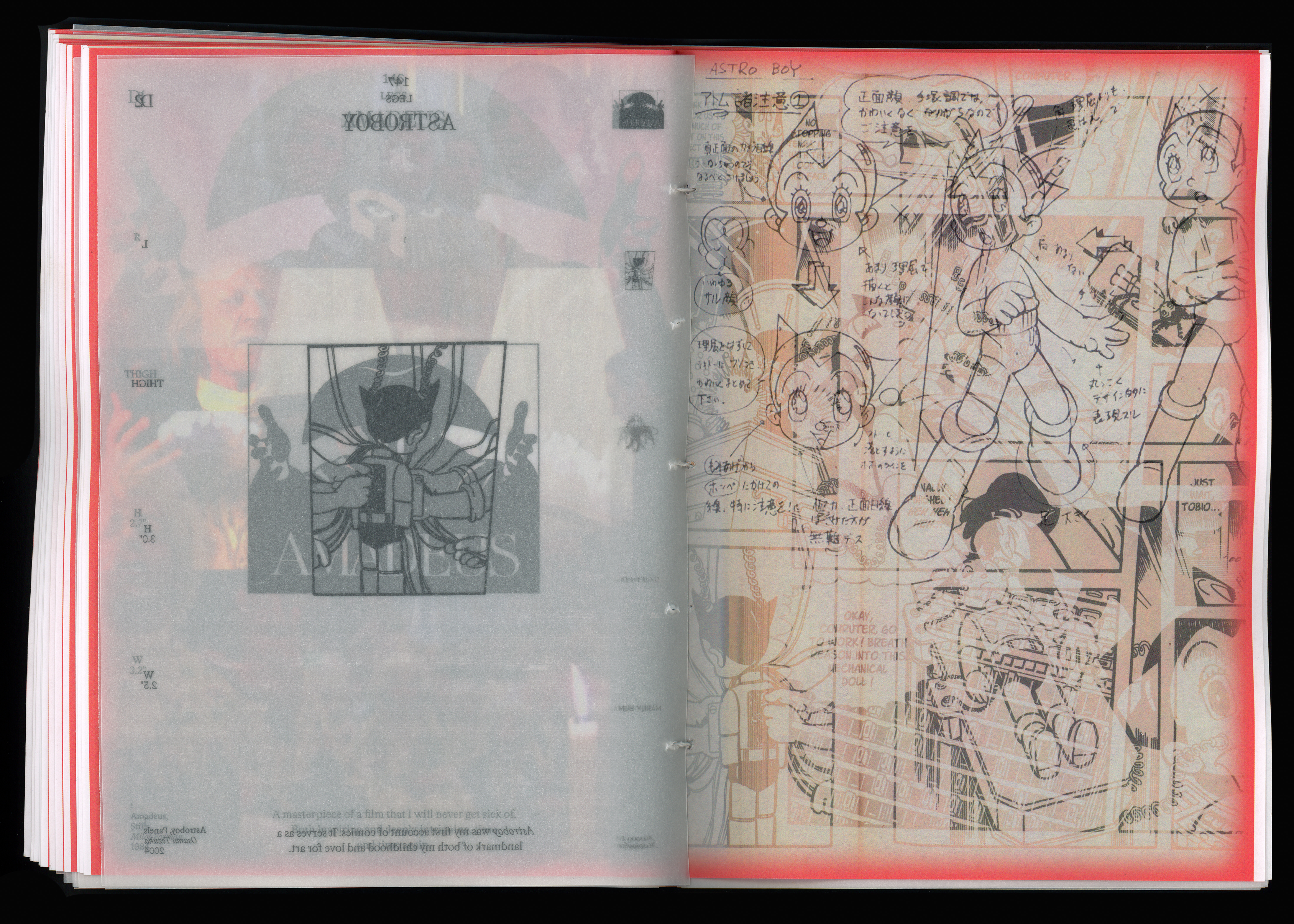
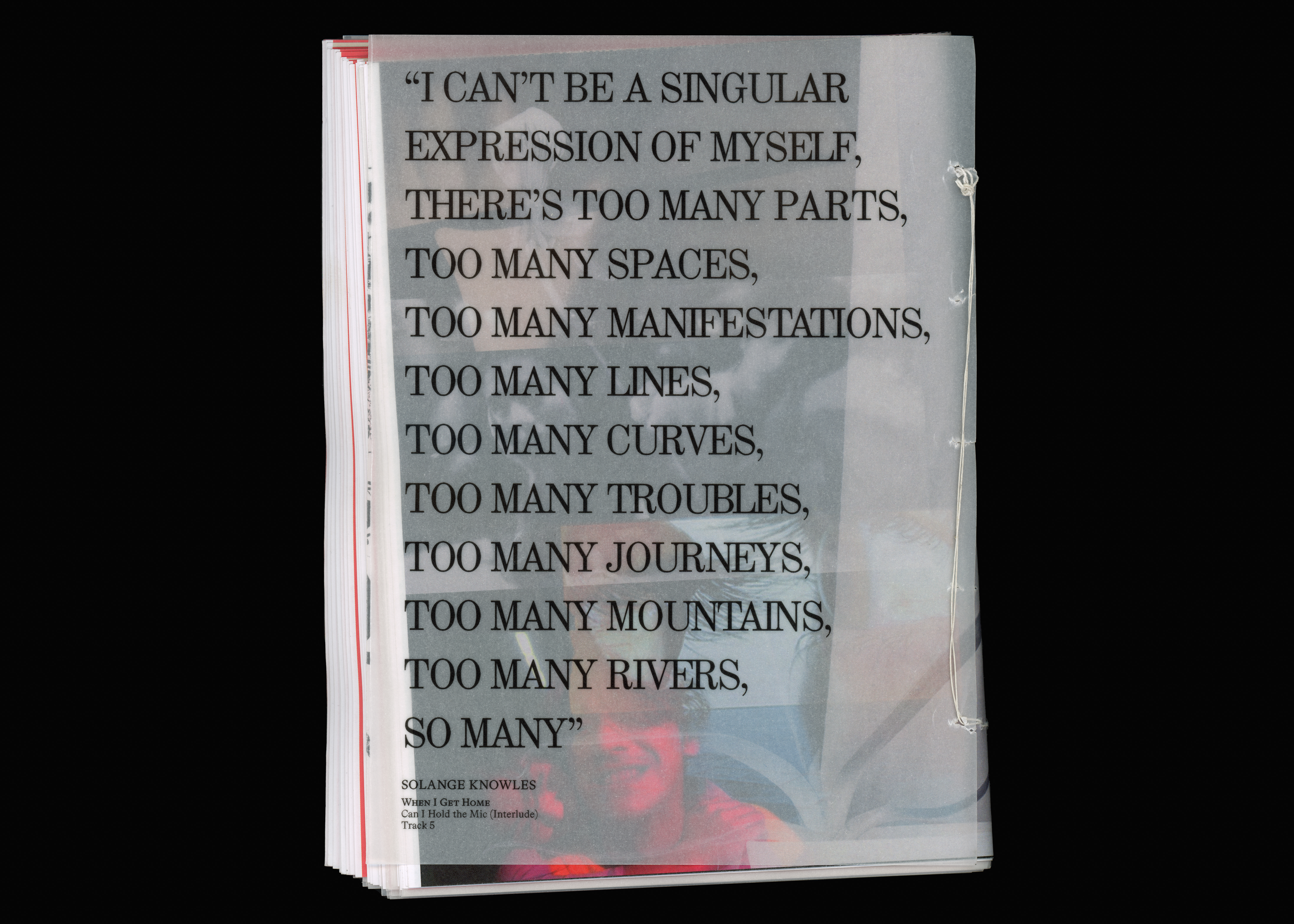
Layers of Mementos is a visual representation of my tattoo journal, weaving together quotes, moments, and symbols into a tangible printed form. It is a tribute to the many impulsive tattoo sessions that are soon to come.
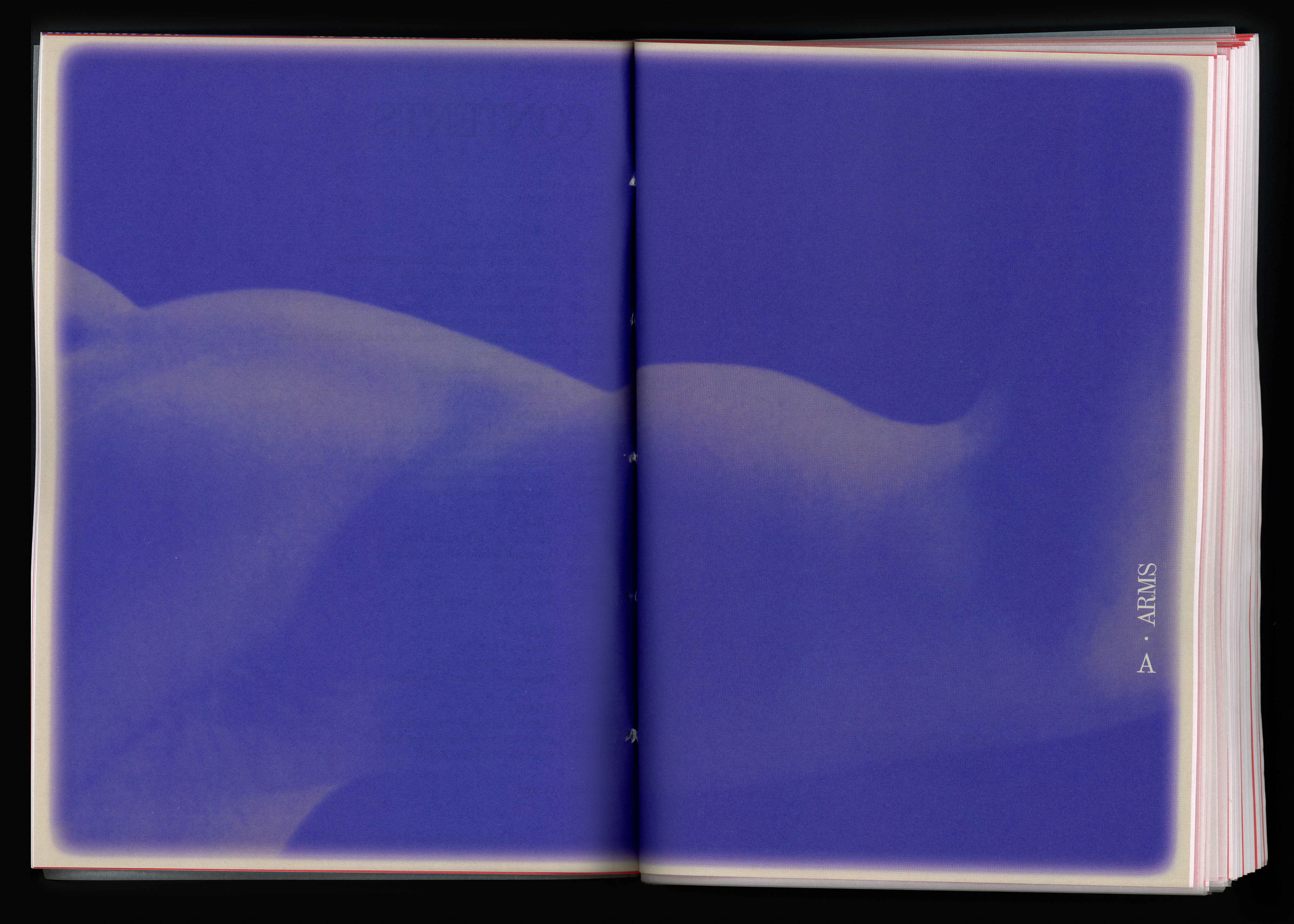
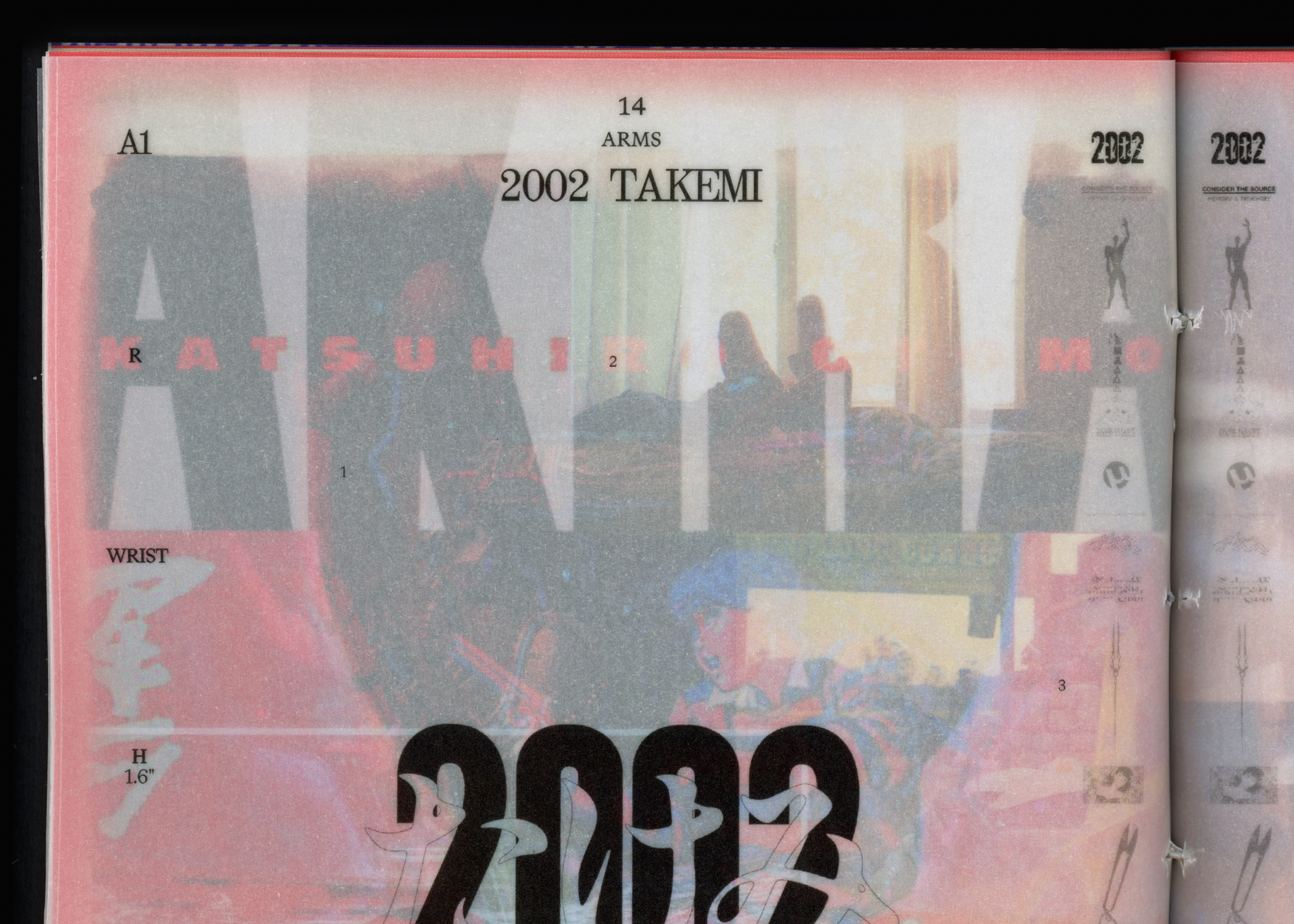
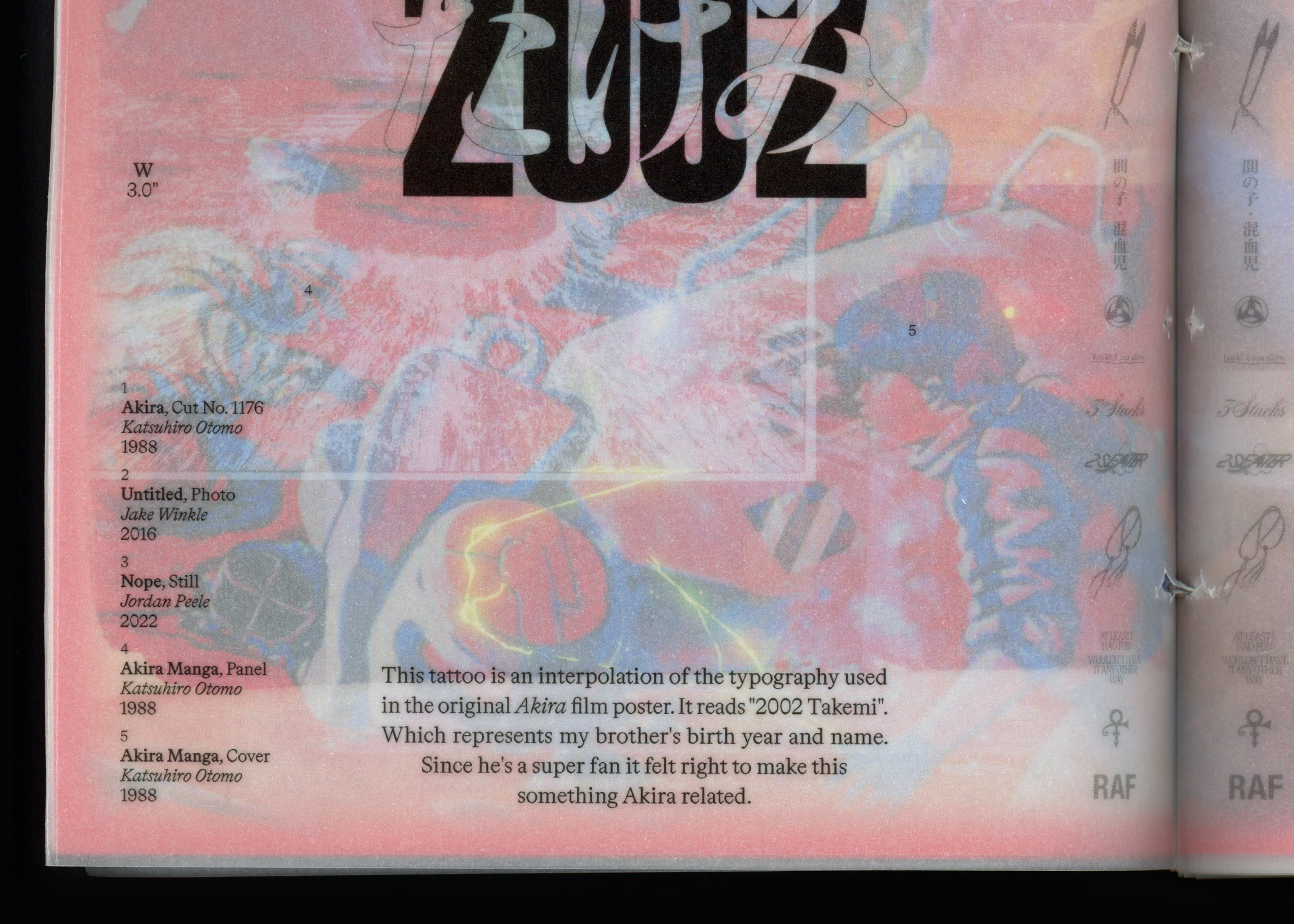
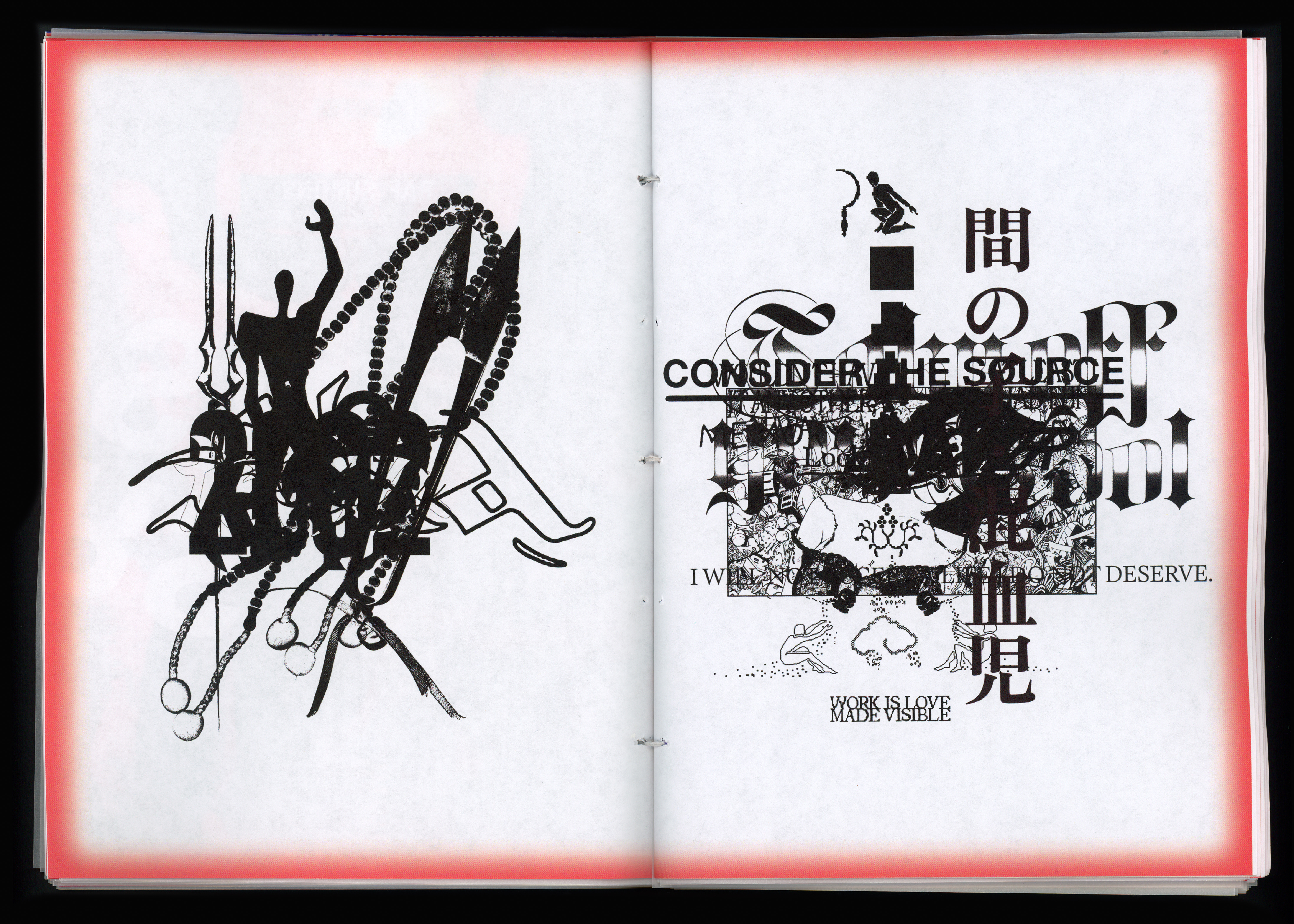
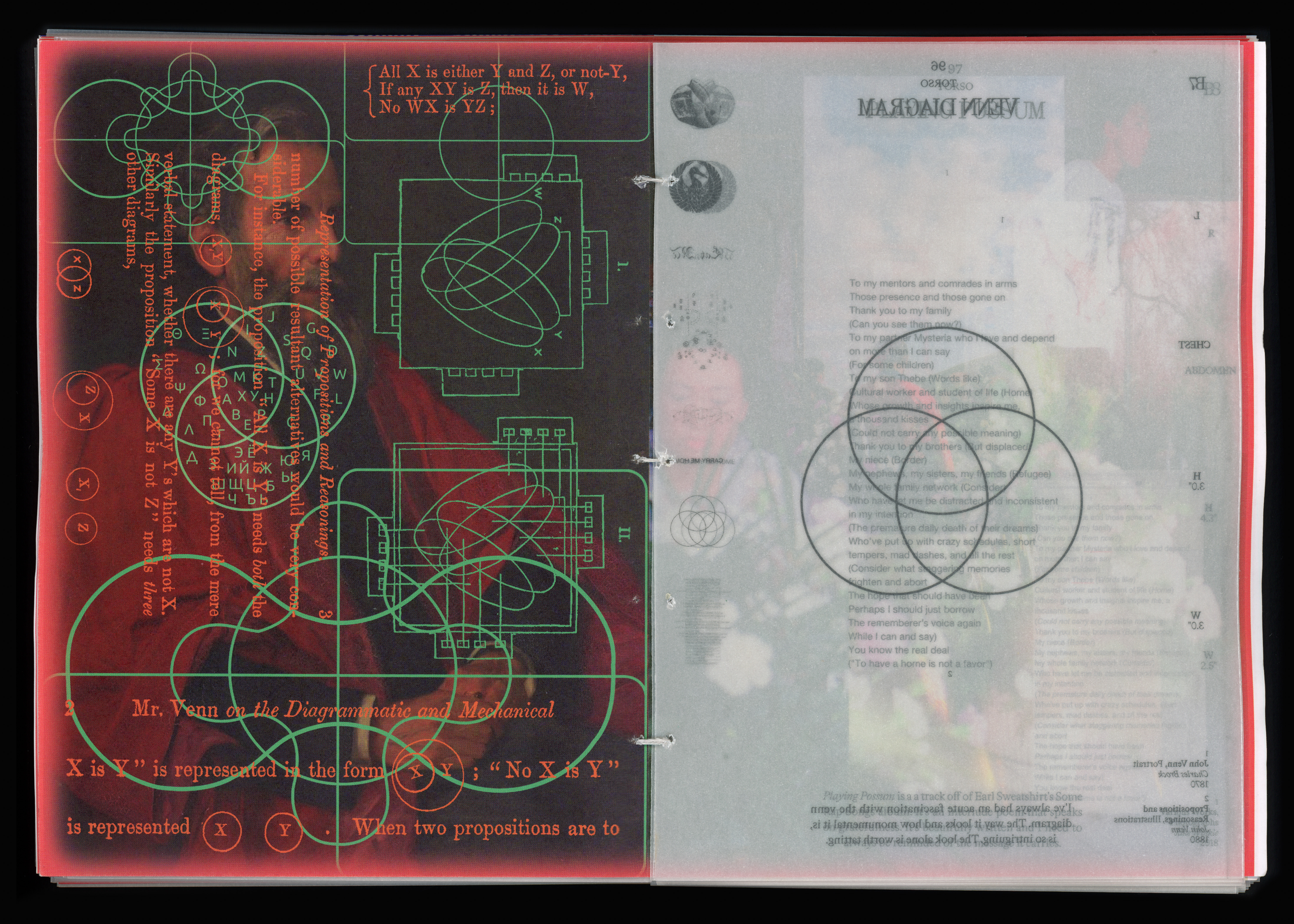
Given the delicacy of this project, the approach was to articulate each tattoo through the means of a collage, an illustration, and a written explanation. Transparent page overlays were utilized for each collage to translate the idea of skin and its many layers. This technique was essential in signifying the depth beyond the surface. As every tattoo carries a story, a range of images, and, most importantly, a reason.
Between 240 pages cut and sewn together, this book embodies all aspects of myself — from skin to cells.
︎︎︎︎︎︎︎


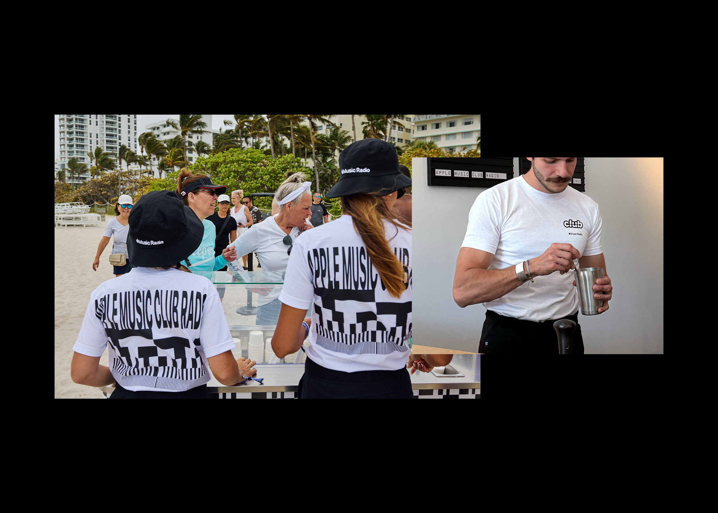
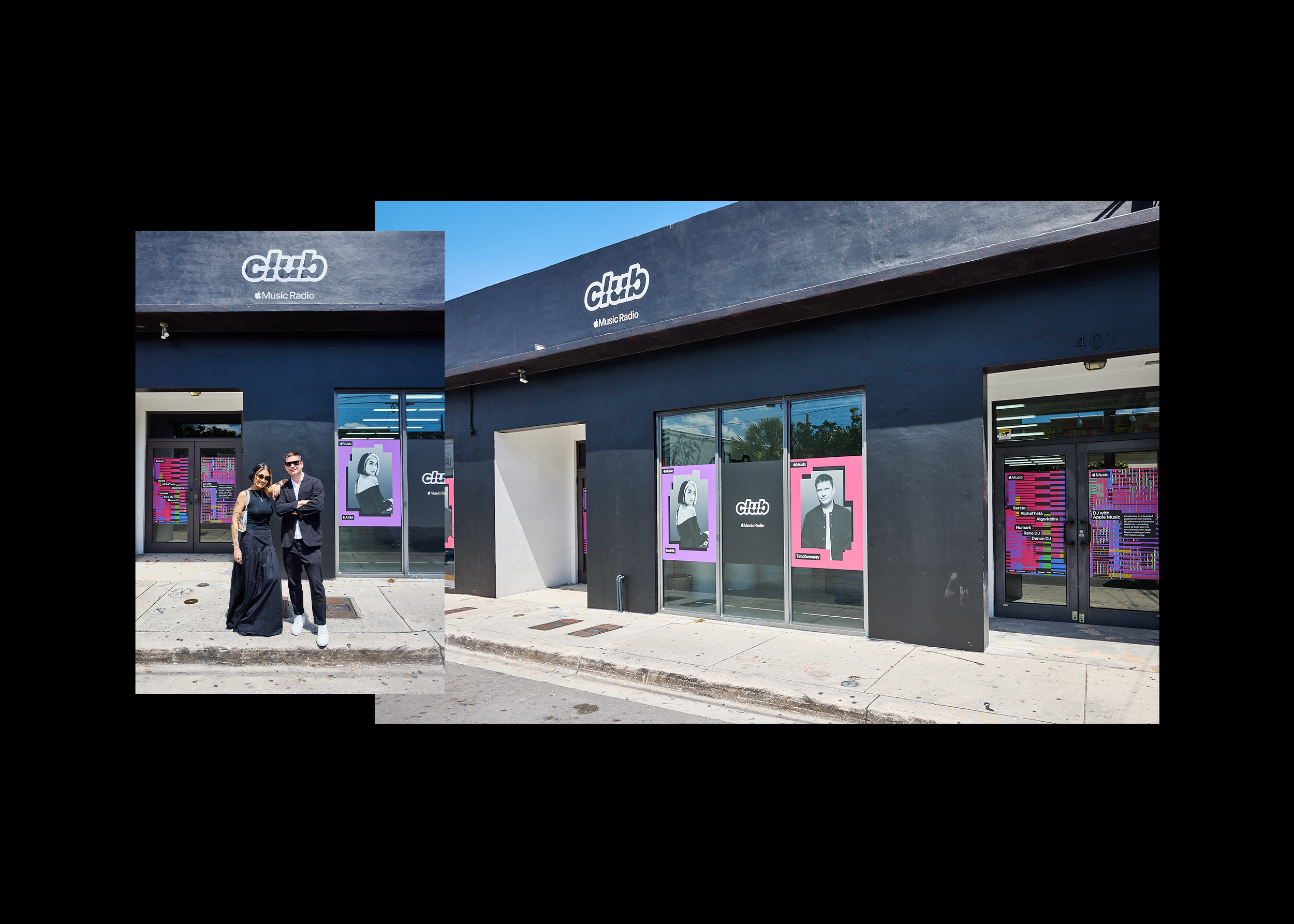
Apple Club Radio Experience
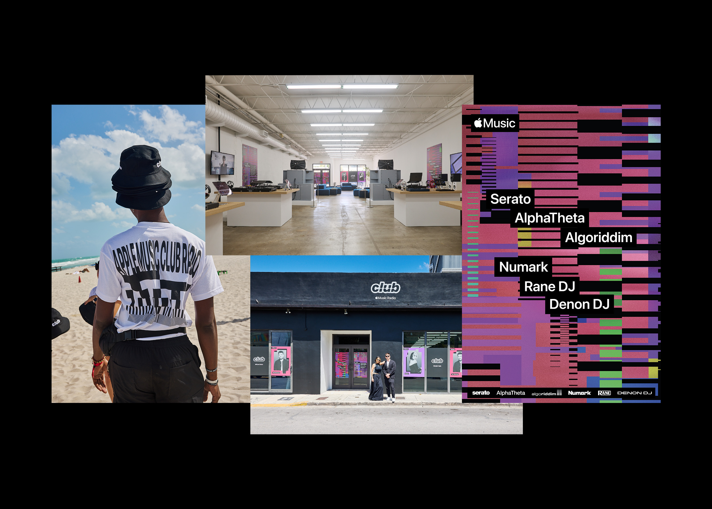
1. Experential Designs
Facades, Displays, Interior
2. Posters + Digtial Invites
24x36” Posters, 1200px Invites
3. Branded Tee
Screenprinted Gildan White Tee’s
For the 2025 Miami Music Week, Apple Music presented the new in-app integration feature for modern DJ controllers. Using the streaming power of Apple Music to load any music into any controller for any session, seamlessly.
I came on as a supporting role to repurpose studio 12:01’s creative across multiple touchpoints; from building wraps to tee’s.
Walkthrough Video
I came on as a supporting role to repurpose studio 12:01’s creative across multiple touchpoints; from building wraps to tee’s.
Walkthrough Video
︎︎︎︎︎︎
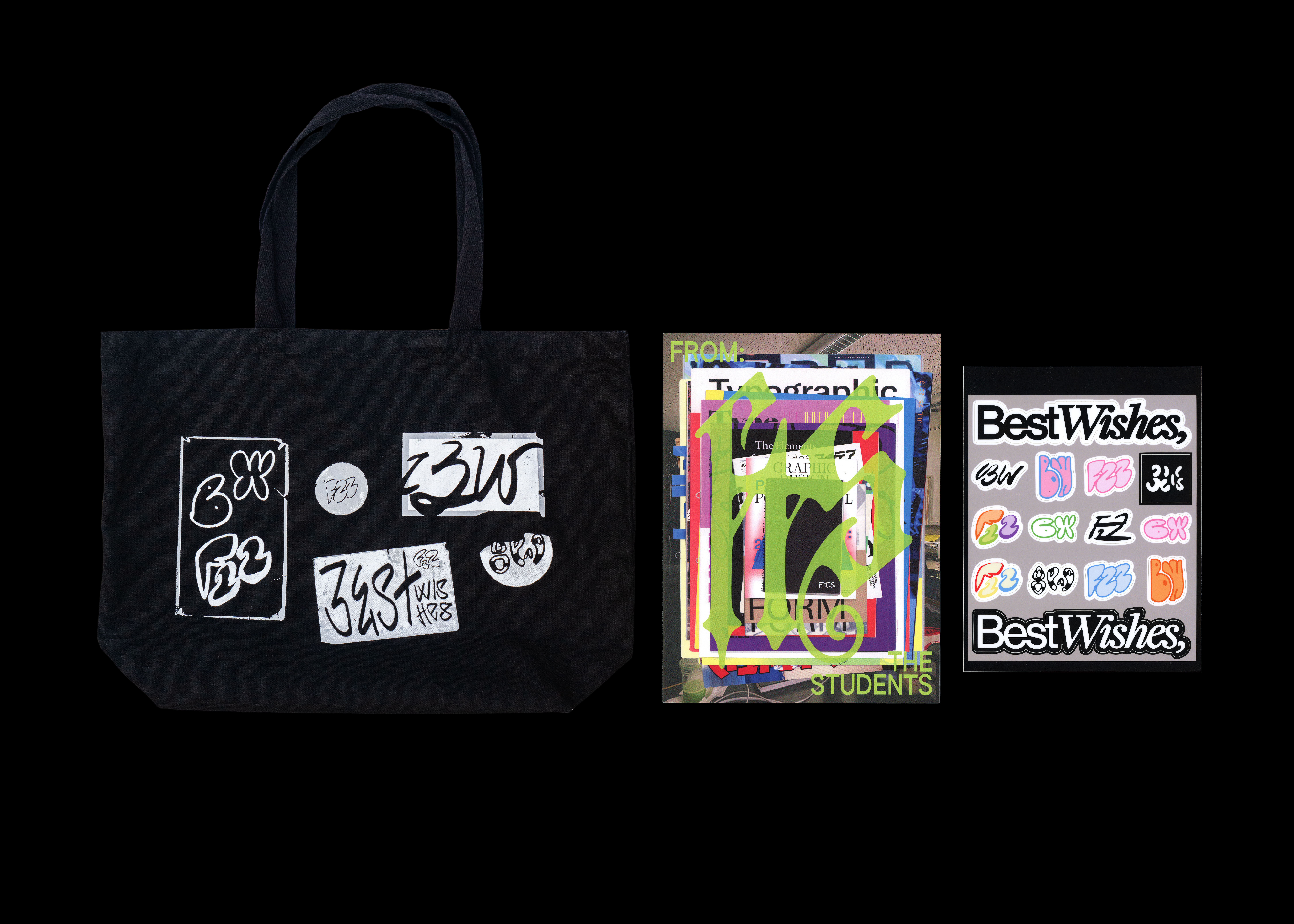
2023 — Merchandise + Illustration
Best Wishes Merch (3)
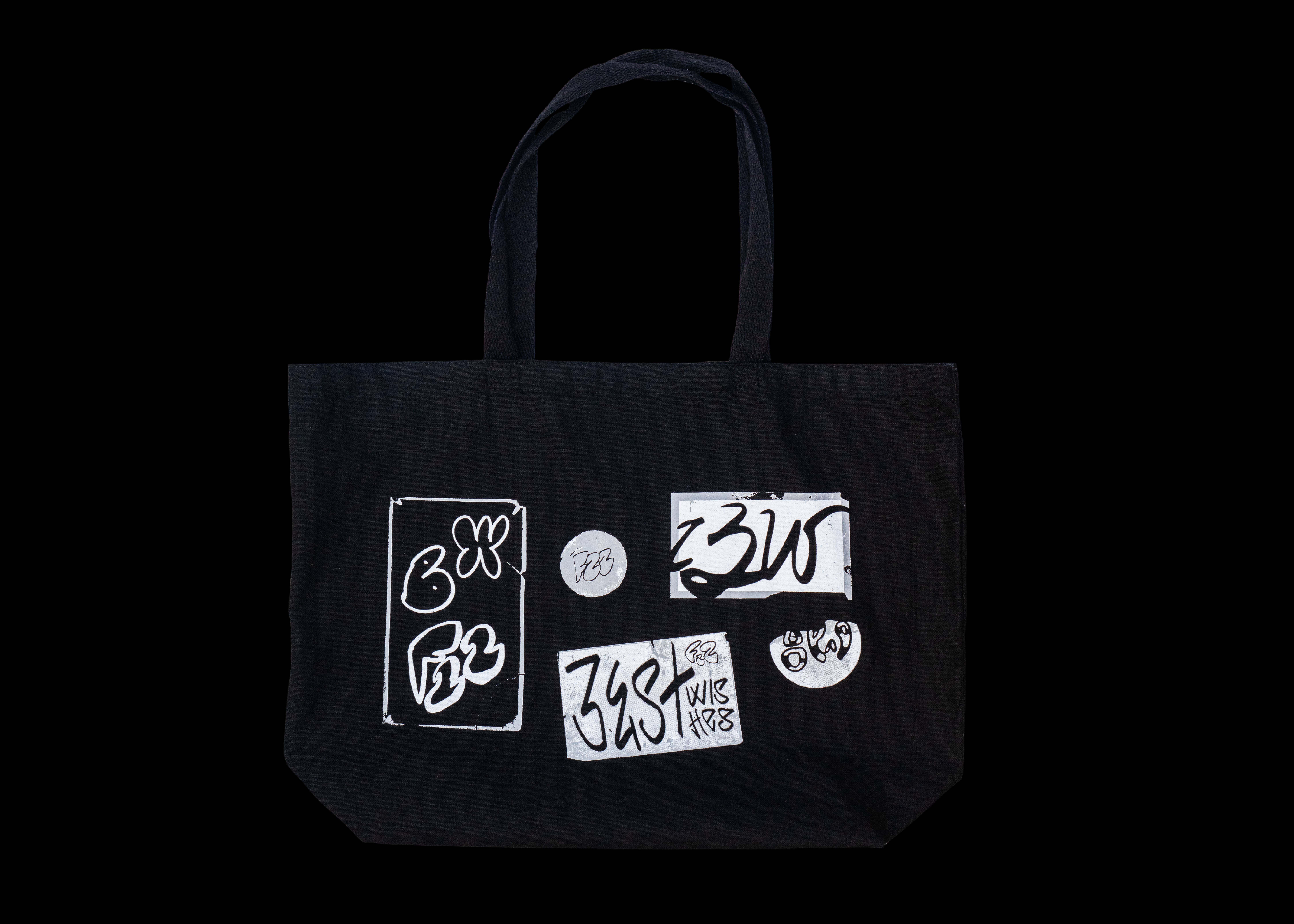
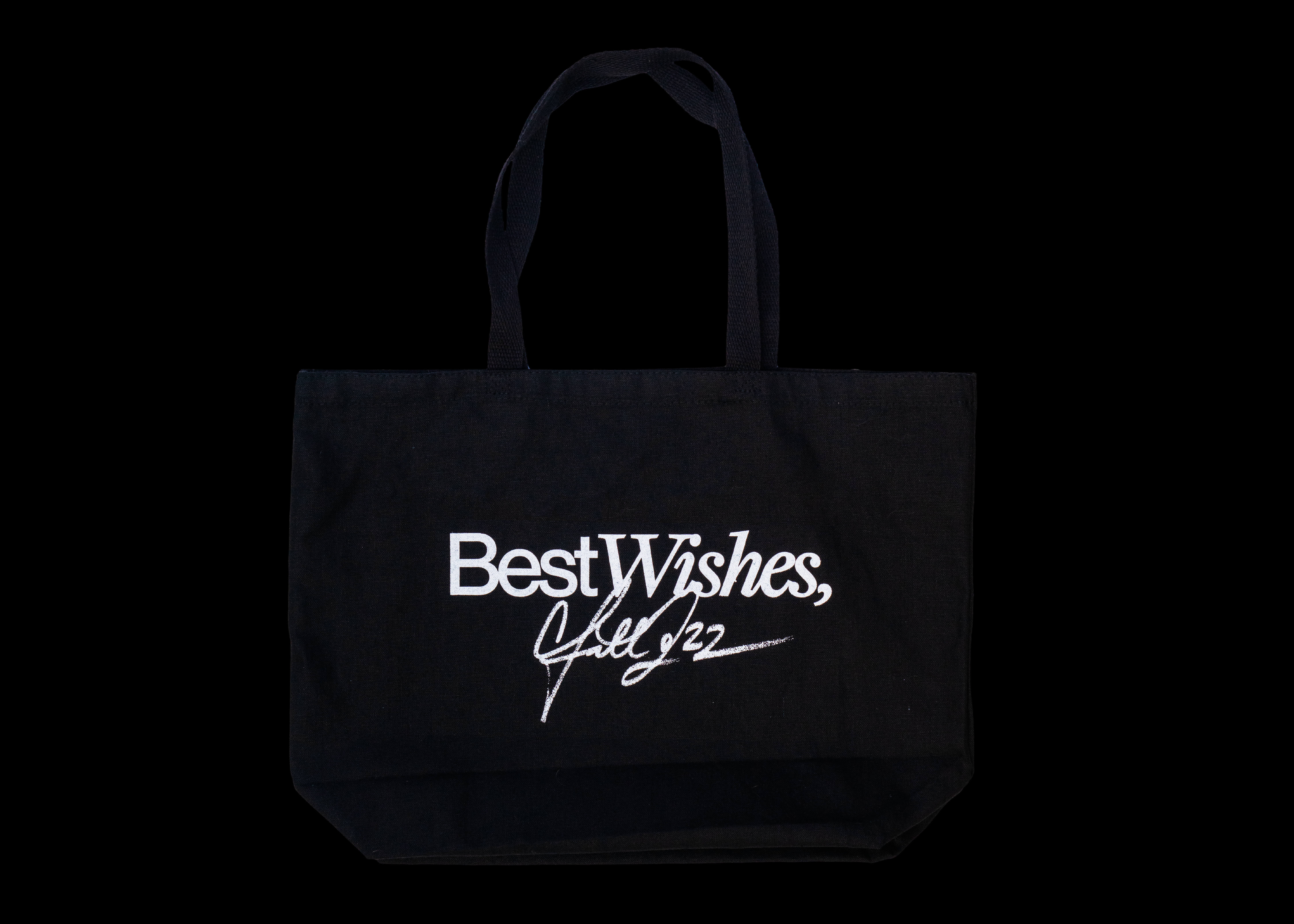
1. Best Wishes Tote Bag
Black Dyed Canvas Tote
15 x 19”
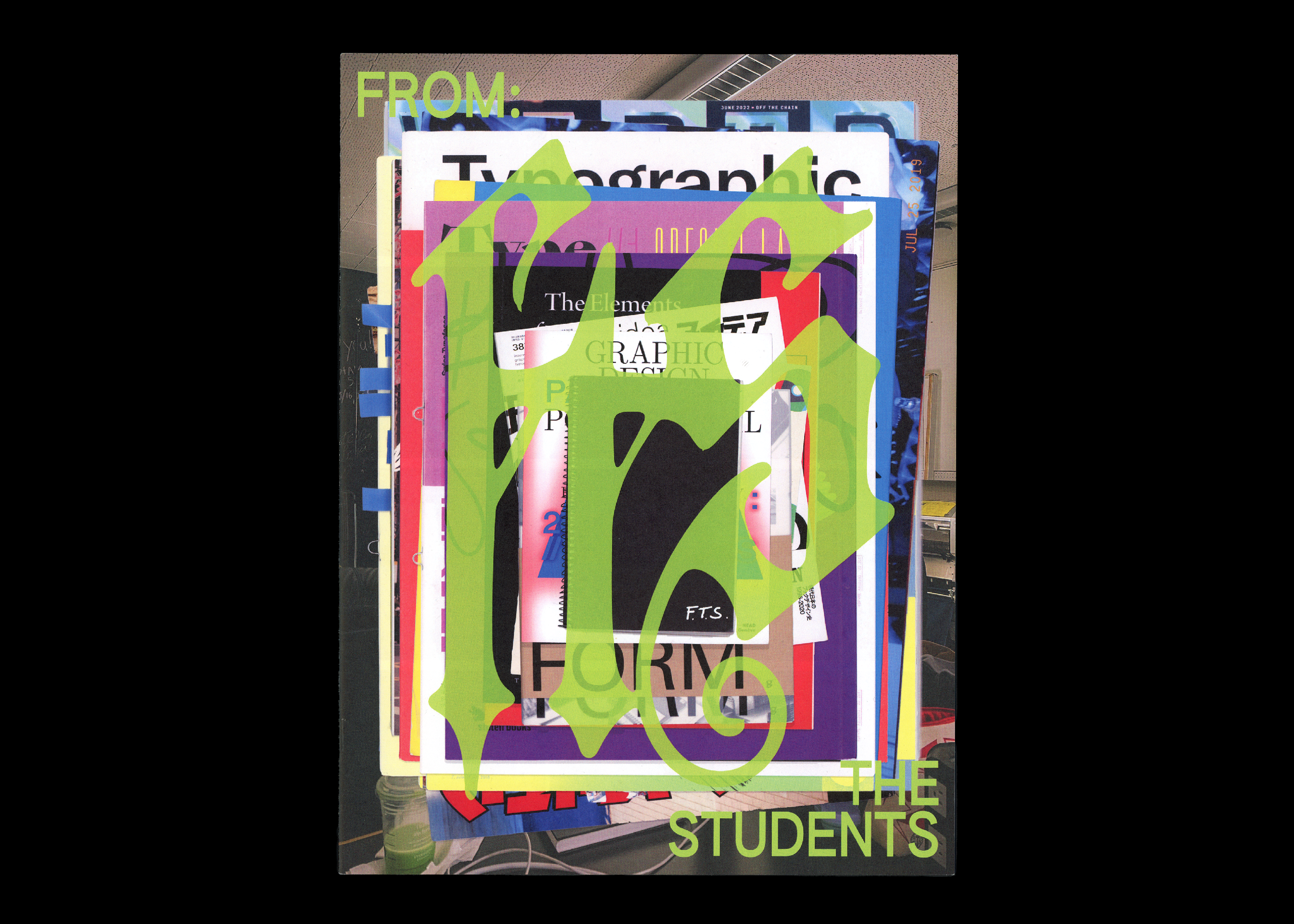
2. F.T.S. Zine (16 pages)
60# Uncoated Text Paper
9 x 12”
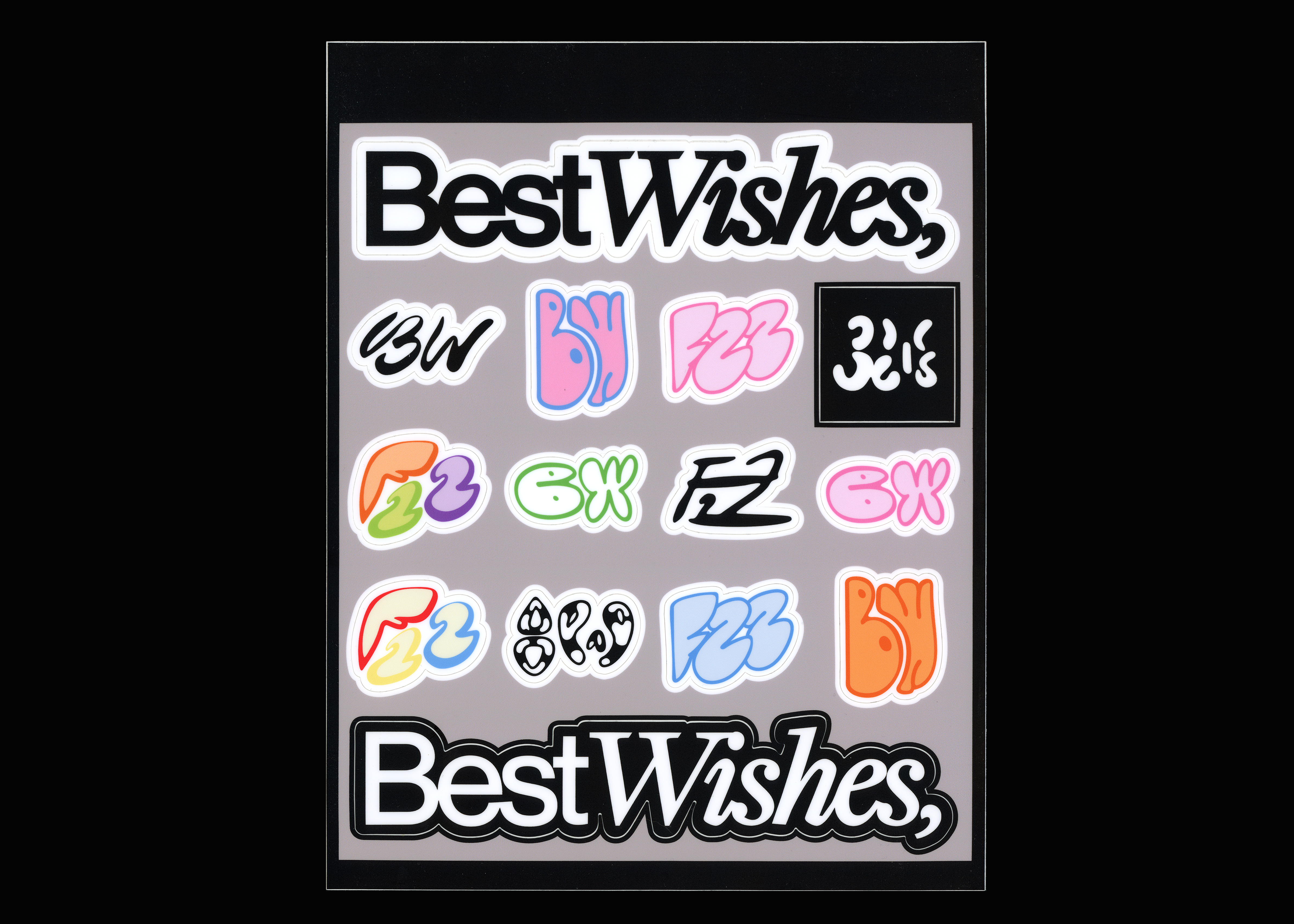
3. Sticker Sheet
Vinyl Stickers
8.5 x 11”
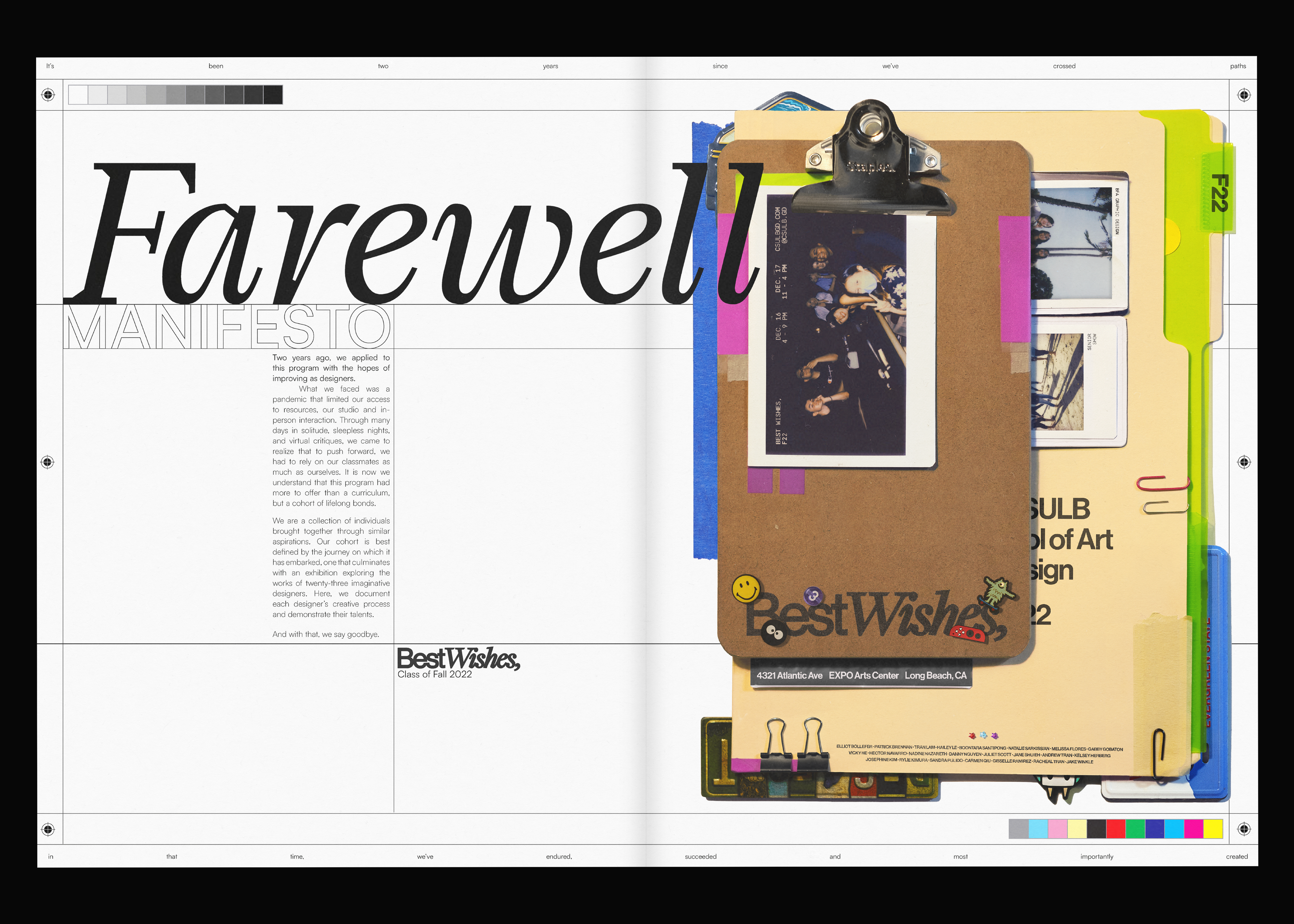
December of 2022, the school of CSU Long Beach held a graduating Graphic Design BFA senior show titled ‘Best Wishes’. I was brought on to the team as the Art Director for the merch line.
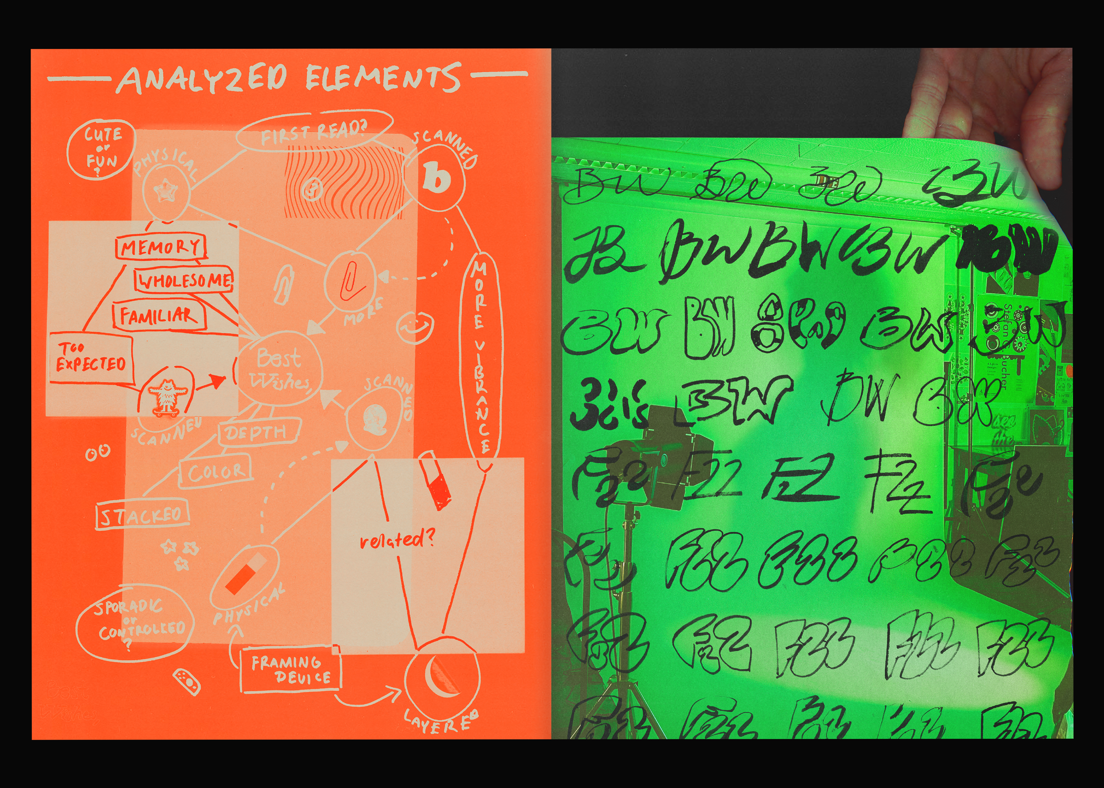
This merch line was created to embody the Best Wishes art show. Uses of a wide color palette and an organic stylization were essential to embodying a group of students that are larger than life. A two-sided duo-toned canvas tote, a 16-page zine, and a sticker sheet were designed and sold.
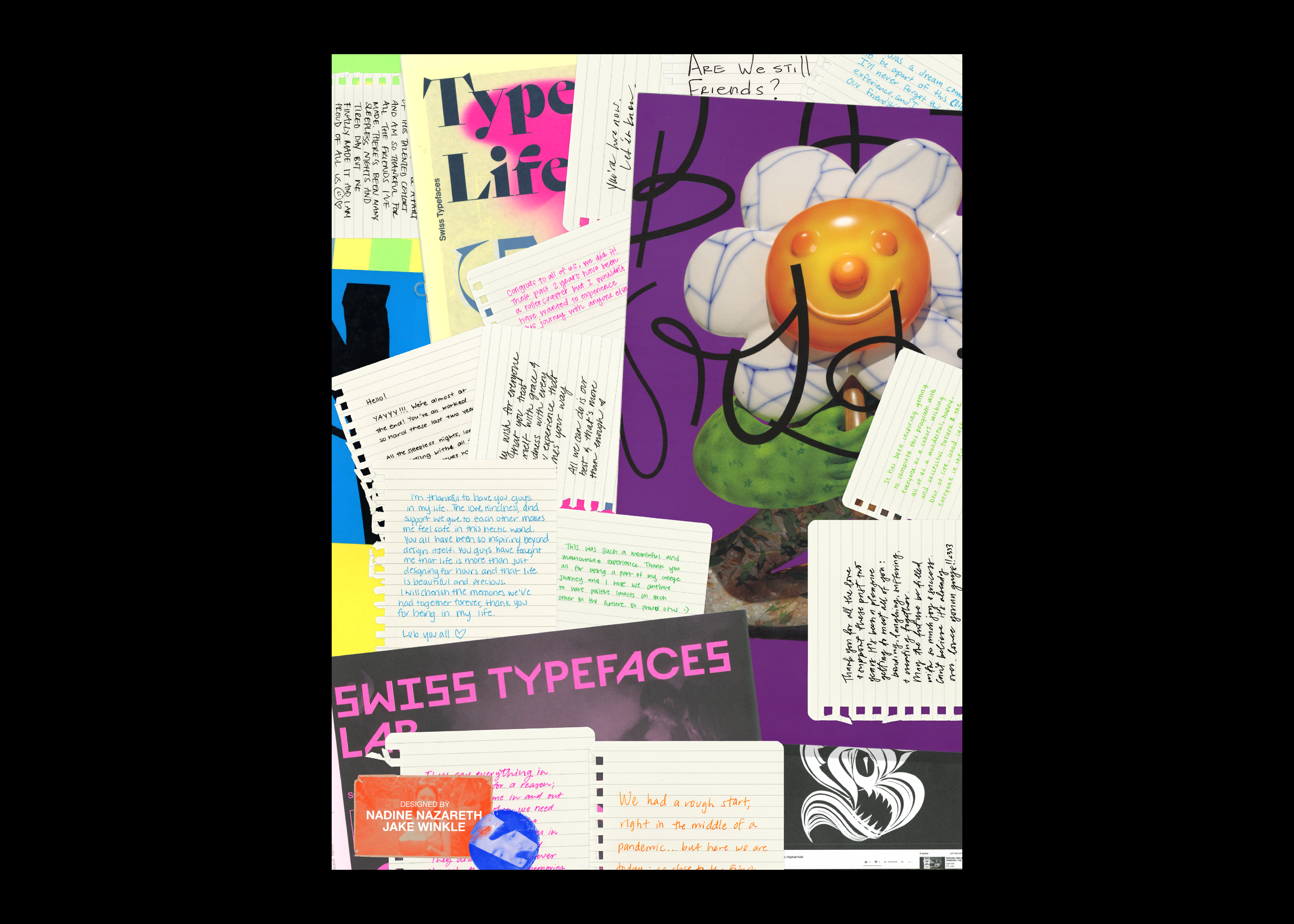
‘From The Students’ (F.T.S.) Zine made in collaboration with designer, Nadine Nazareth.
︎︎︎︎︎

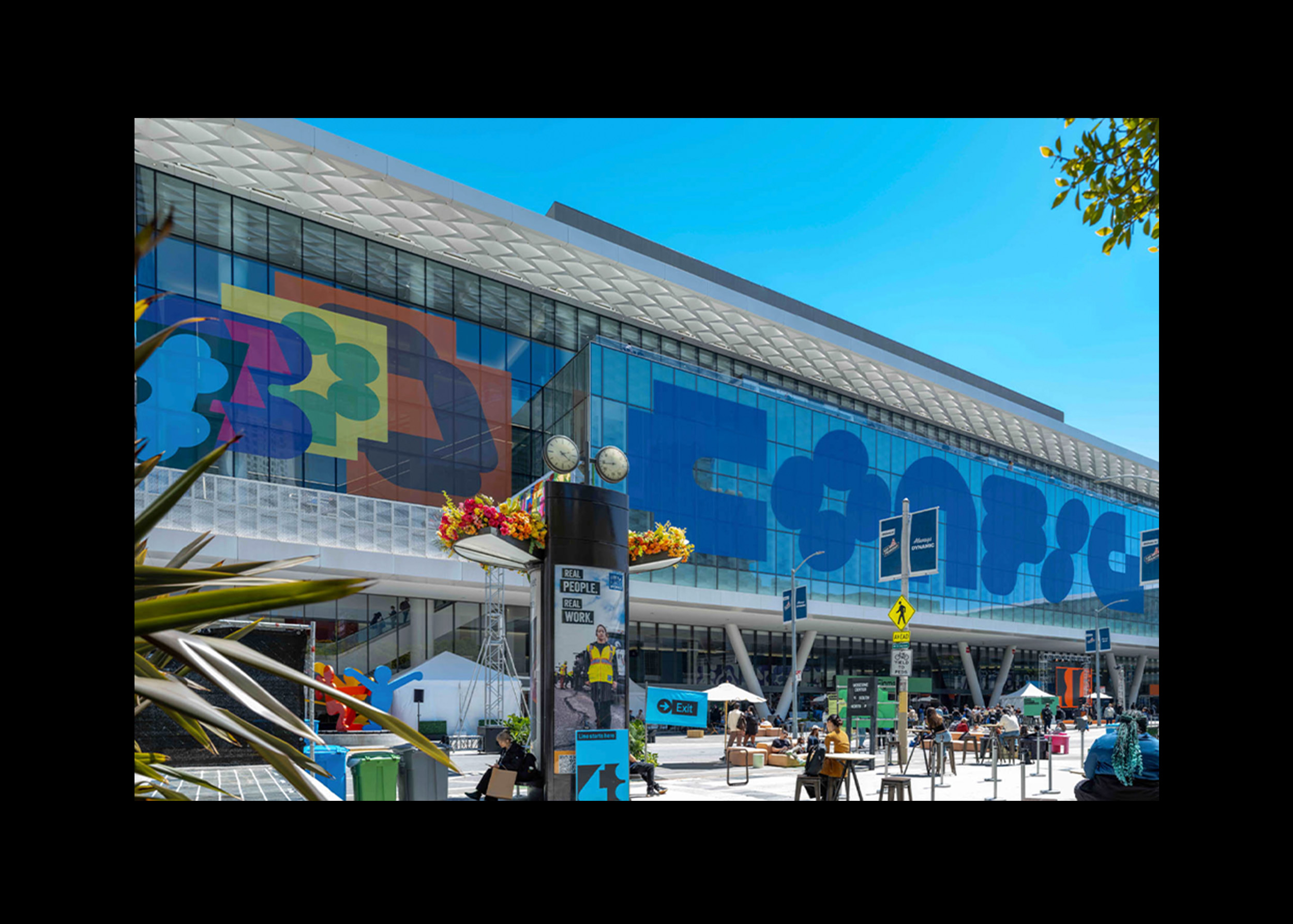


2025 — Experiential
Buildings for Agencies (3)
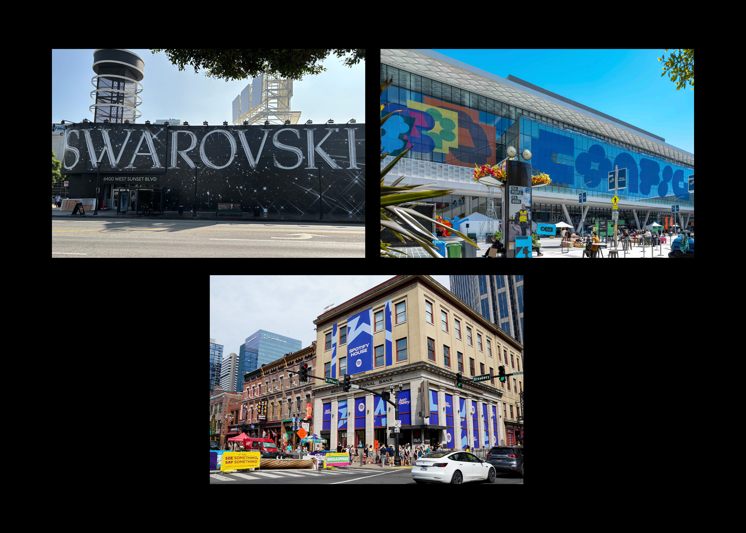
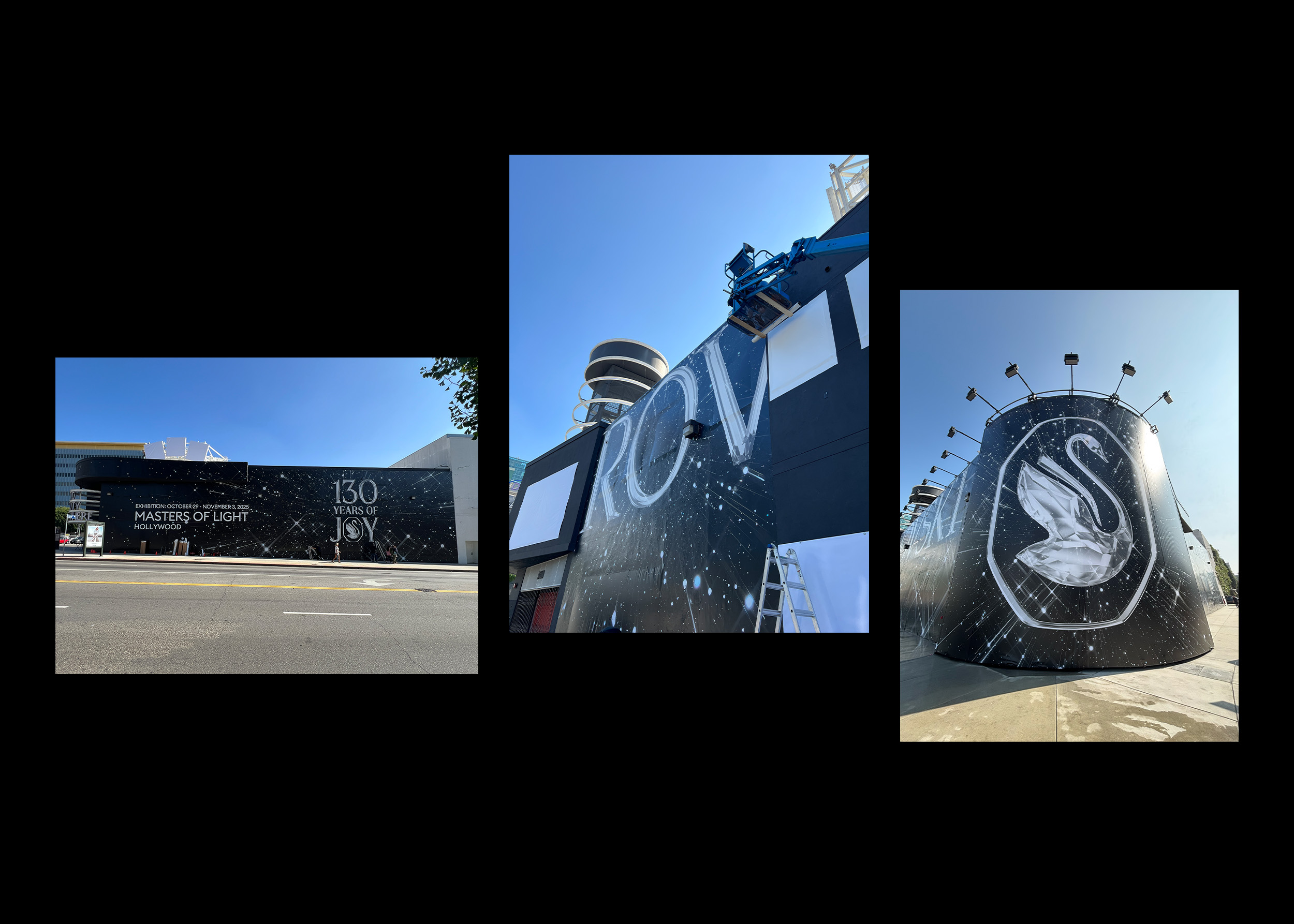
1. Swarovski: Masters of Light Hollywood Exhibition
Oct 29-Nov 3, 2025 | Kennedy London
– 3 Face, 2 Corner Vinyl Building Wrap
(more here)
2. Figma: Config 2025
May 6-8, 2025 | VTProDesign
– 1 Face Vinyl Building Wrap
– Panel Slides
(more here)
3. Spotify: CMA Fest 2025
June 5-7, 2025 | Bureau Betak
– 2 Face Vinyl Building Wrap
(more here)
Lots of freelance work for lots of agencies.
Me and my AD’s against the world, creating larger than life experiences for cars and planes. All vinyl everything.
Me and my AD’s against the world, creating larger than life experiences for cars and planes. All vinyl everything.
︎︎︎︎
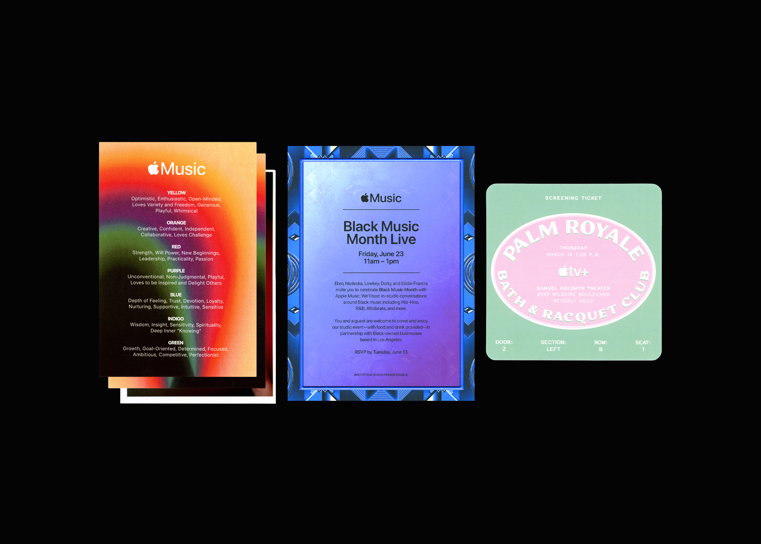

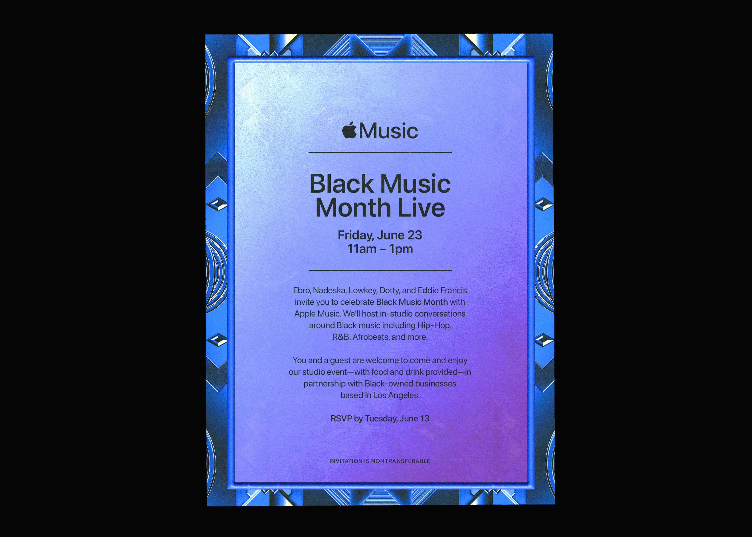
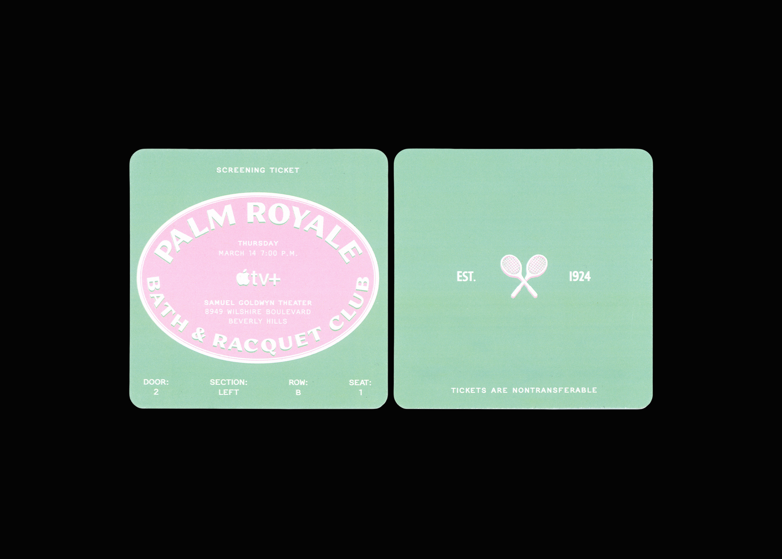
Apple Ephemera (3)
1. Aura – Photo Giveaway Moment
Apple Music: 2024 Coachella Artist Relations Event
2. Black Music Month Live – Digital Invite
1200 x 1650px
3. Palm Royale – Printed Ticket
Apple TV+: 2024 Palm Royale Premiere
4.5 x 4.5”
Here are three major projects I contributed to as a junior graphic designer for Apple Music and Apple TV+. My role was to bring events to life through thoughtful design—creating everything from engaging invitations to sponsored bar menus and bespoke giveaways. I specialized in translating the Apple brand seamlessly across any application, any surface.
︎︎︎
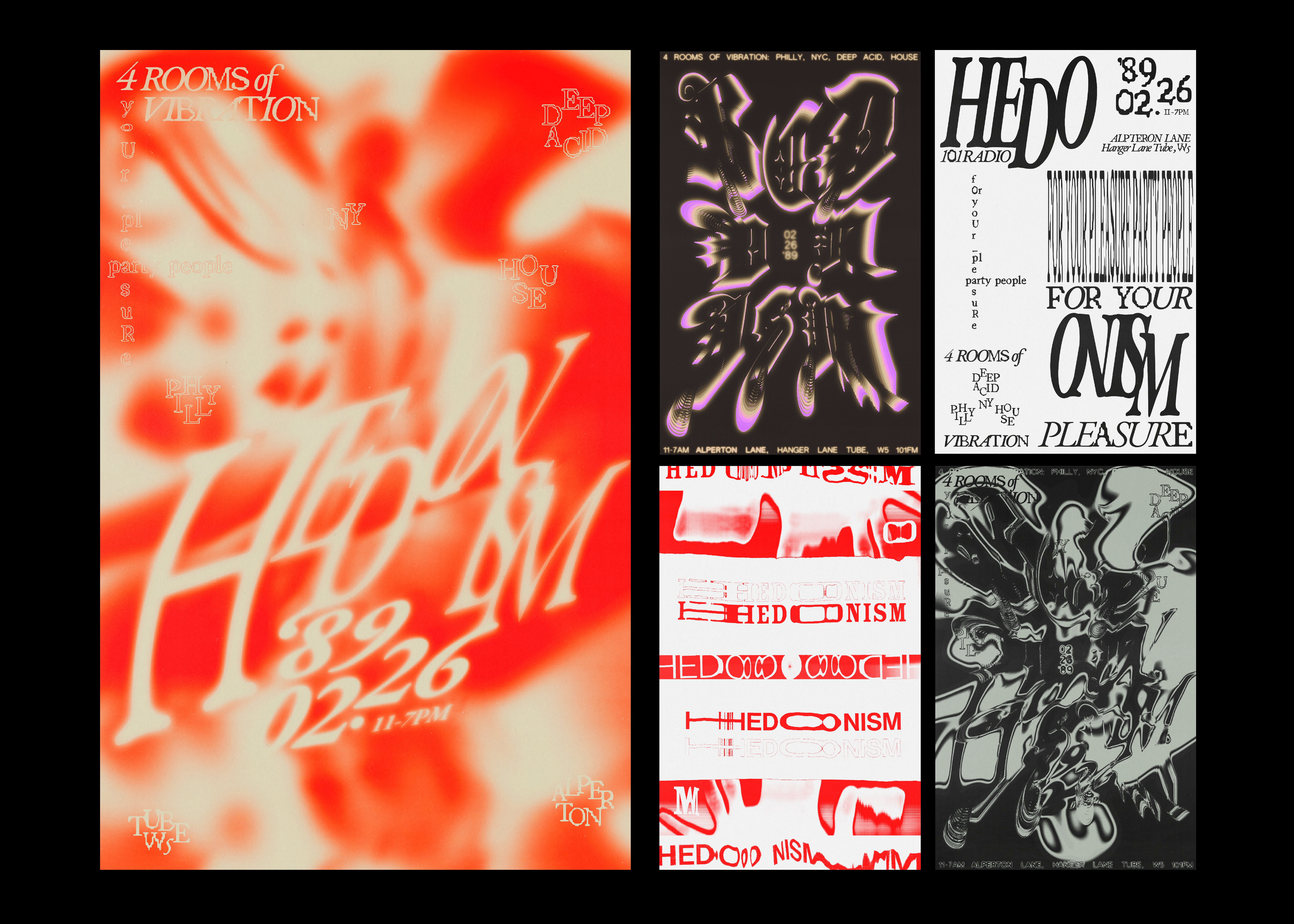
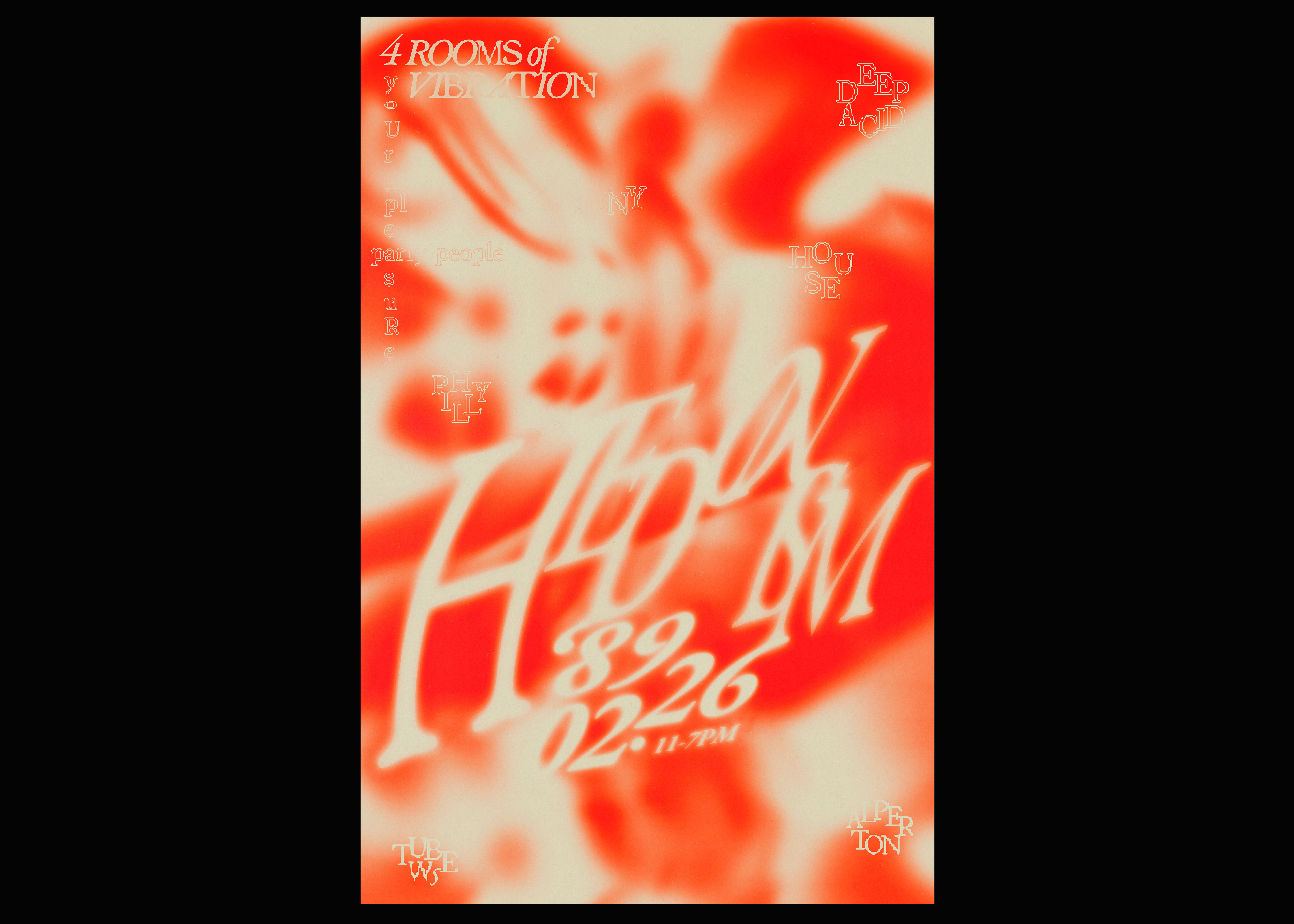
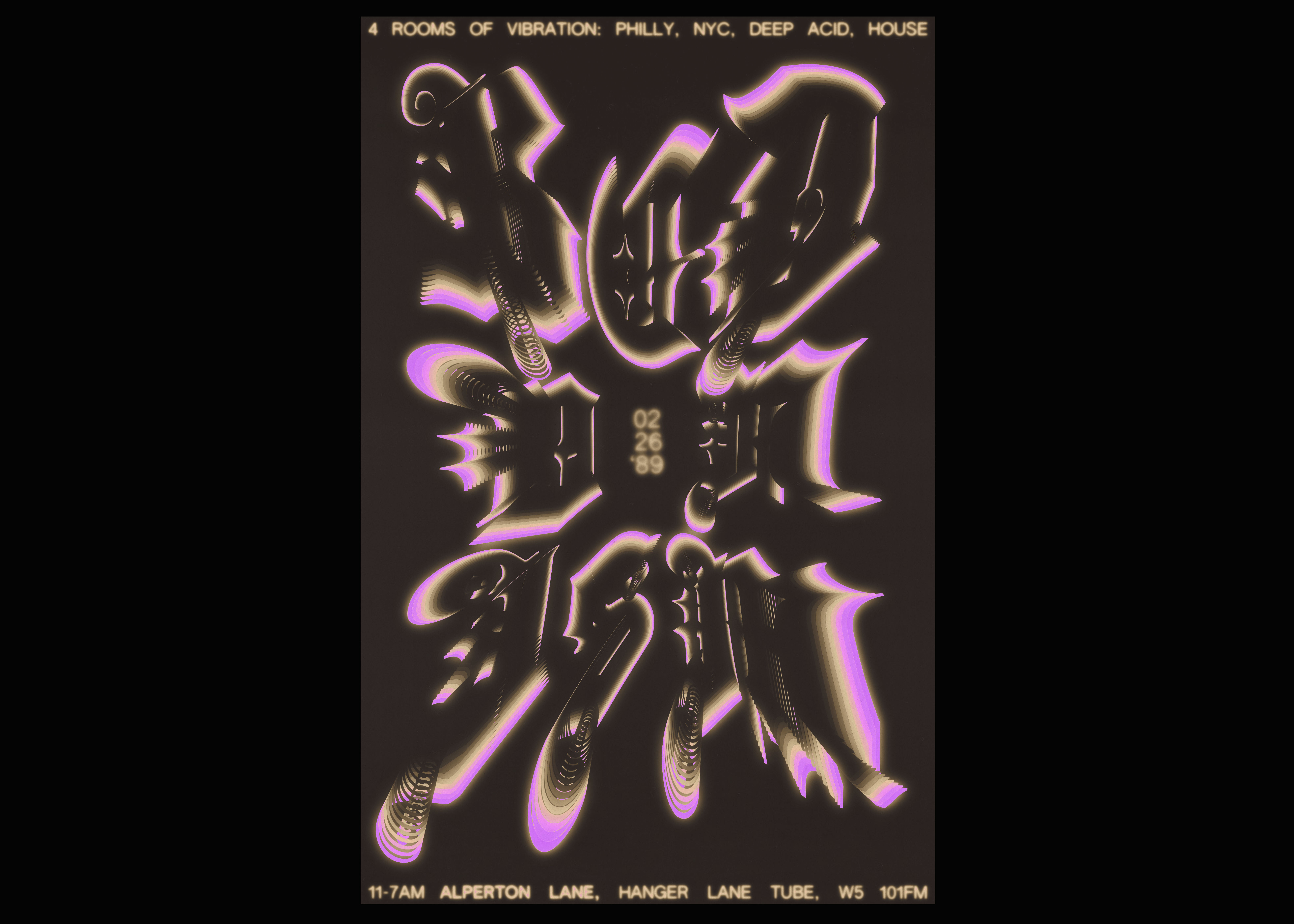

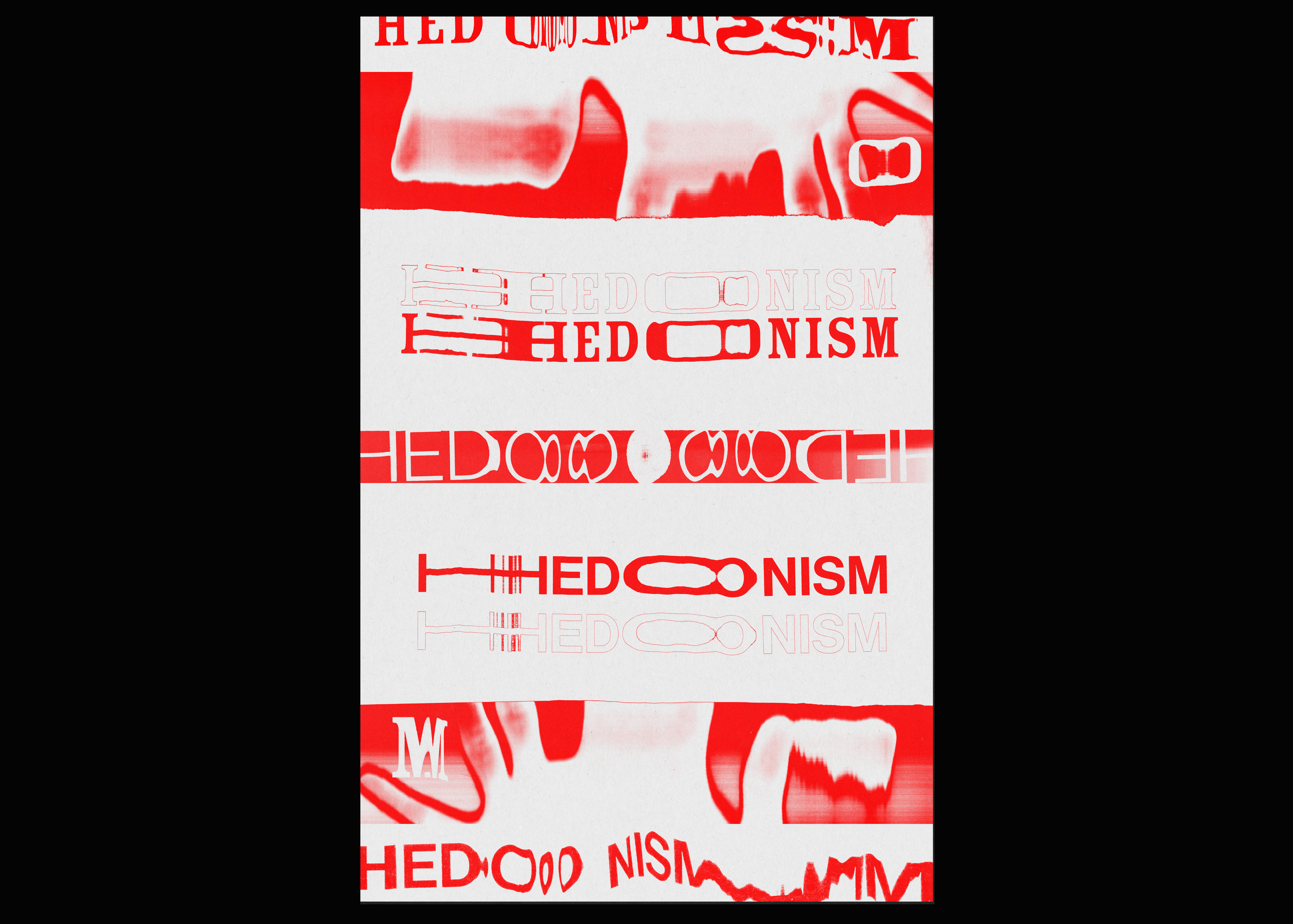
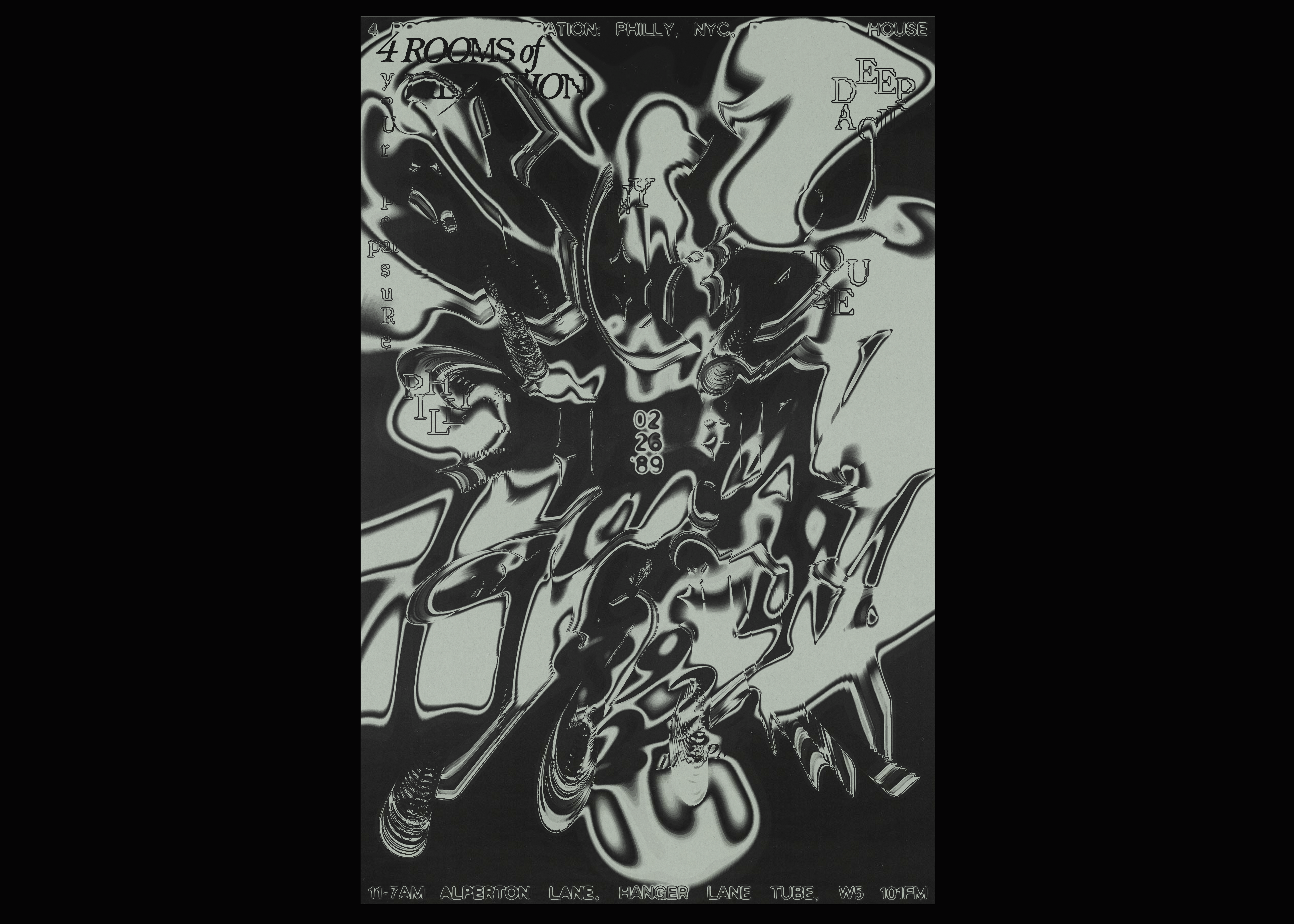
Hedonism
Poster (1 final, 5 iterations)
Semi-Gloss Cardstock
11 x 17”
In this school project, nine unique posters were integrated to produce a single, multi-layered event poster. Each iteration adhered to specific methodologies, addressing the depth required to convey the perception of an event poster. This included the use of illustrations in one, adopting a representational approach in another, and even working in complete opposites for a few.
Inspired by one of the earliest UK raves known as "Hedonism," the goal was to capture something ephemeral and equally vibrant.
To create the final composition, careful curation of ideas and elements from different iterations was undertaken. An inkling from one composition was incorporated, another was slightly disregarded, and the styling from one with a lasting impact was retained. All of this cross referencing and combining led to the sole final product, presenting a cohesive body of work that is concise in its intent and stylized when necessary.
︎︎
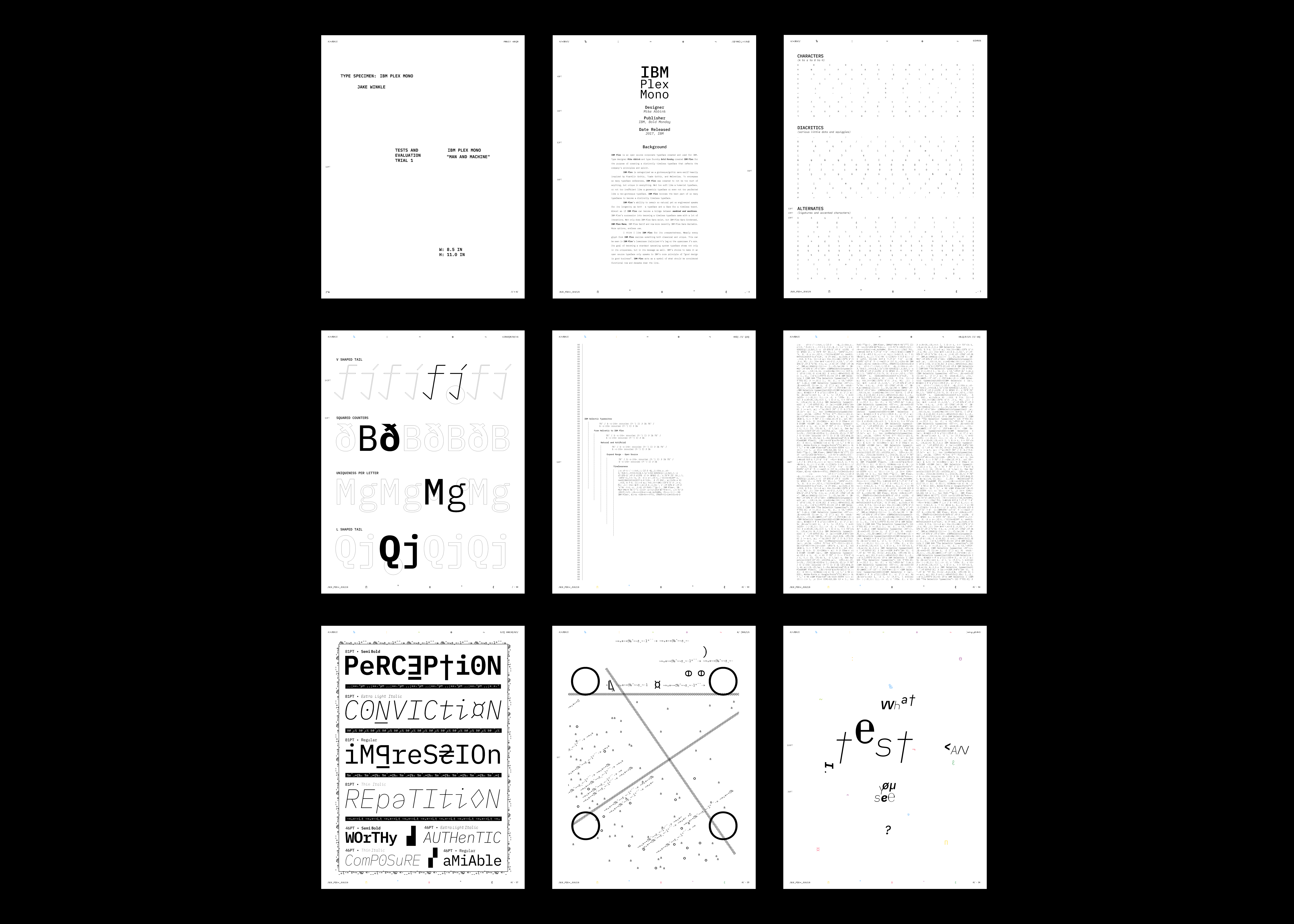

2022 — Graphics + Illustration + Art Direction
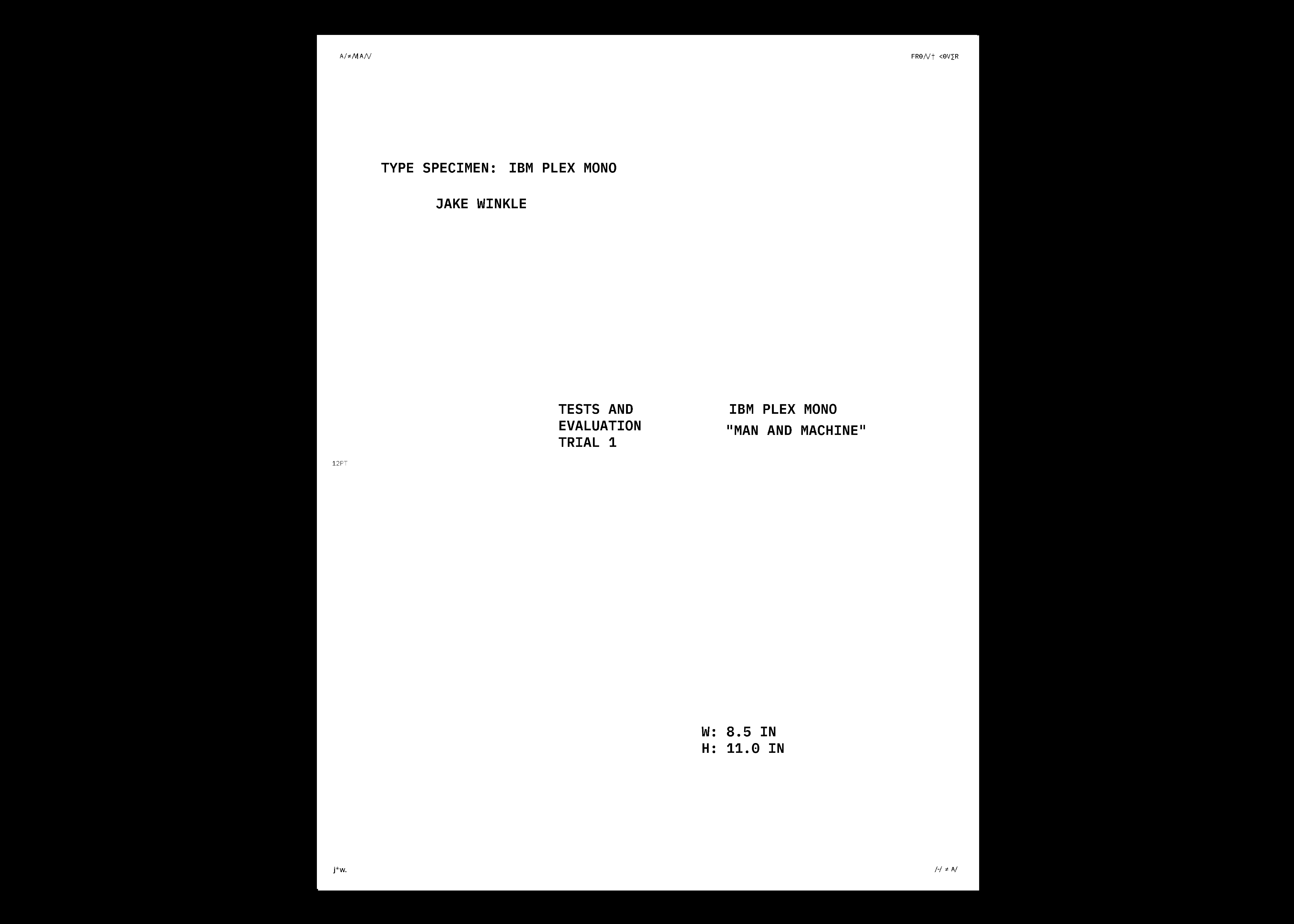
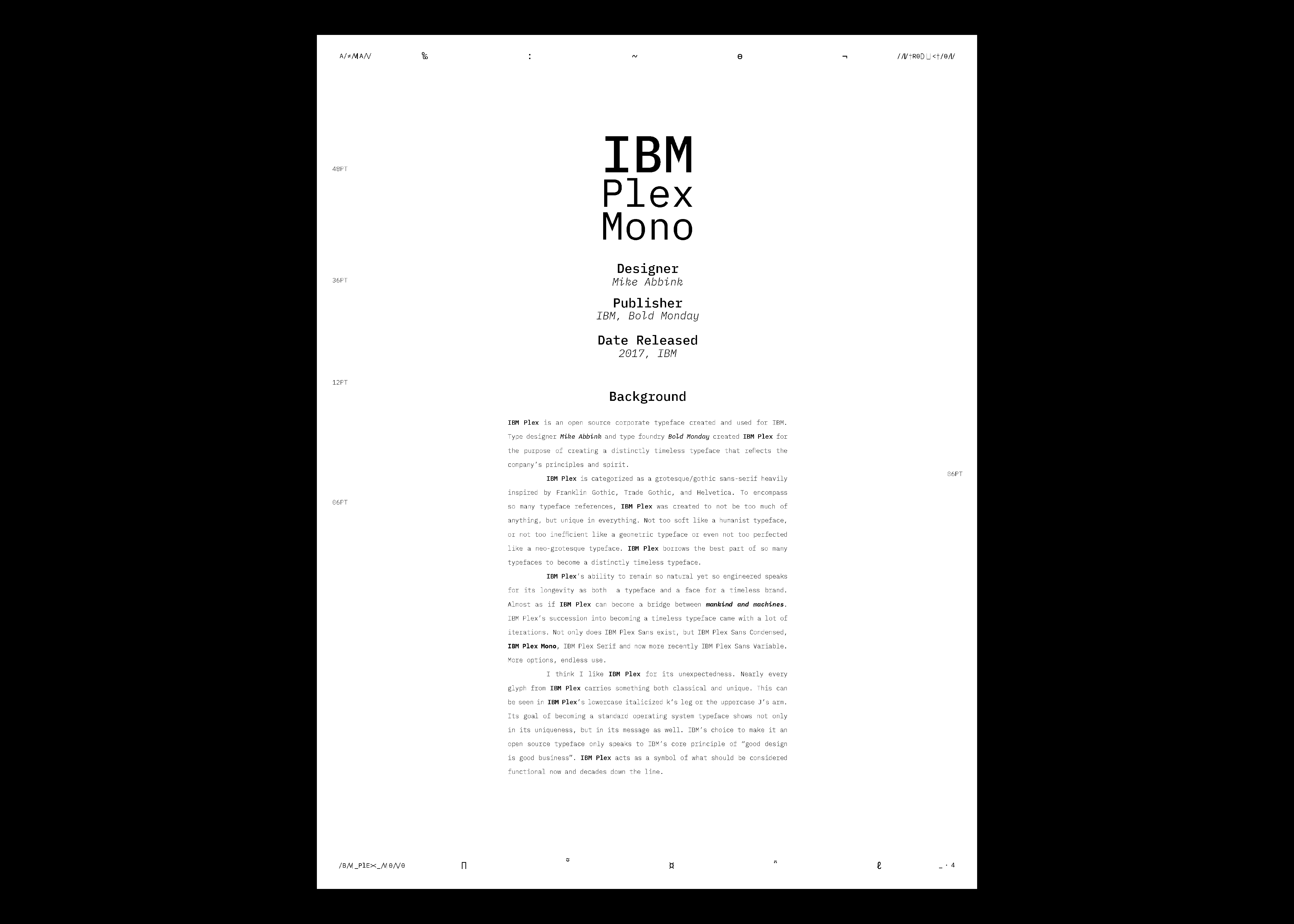
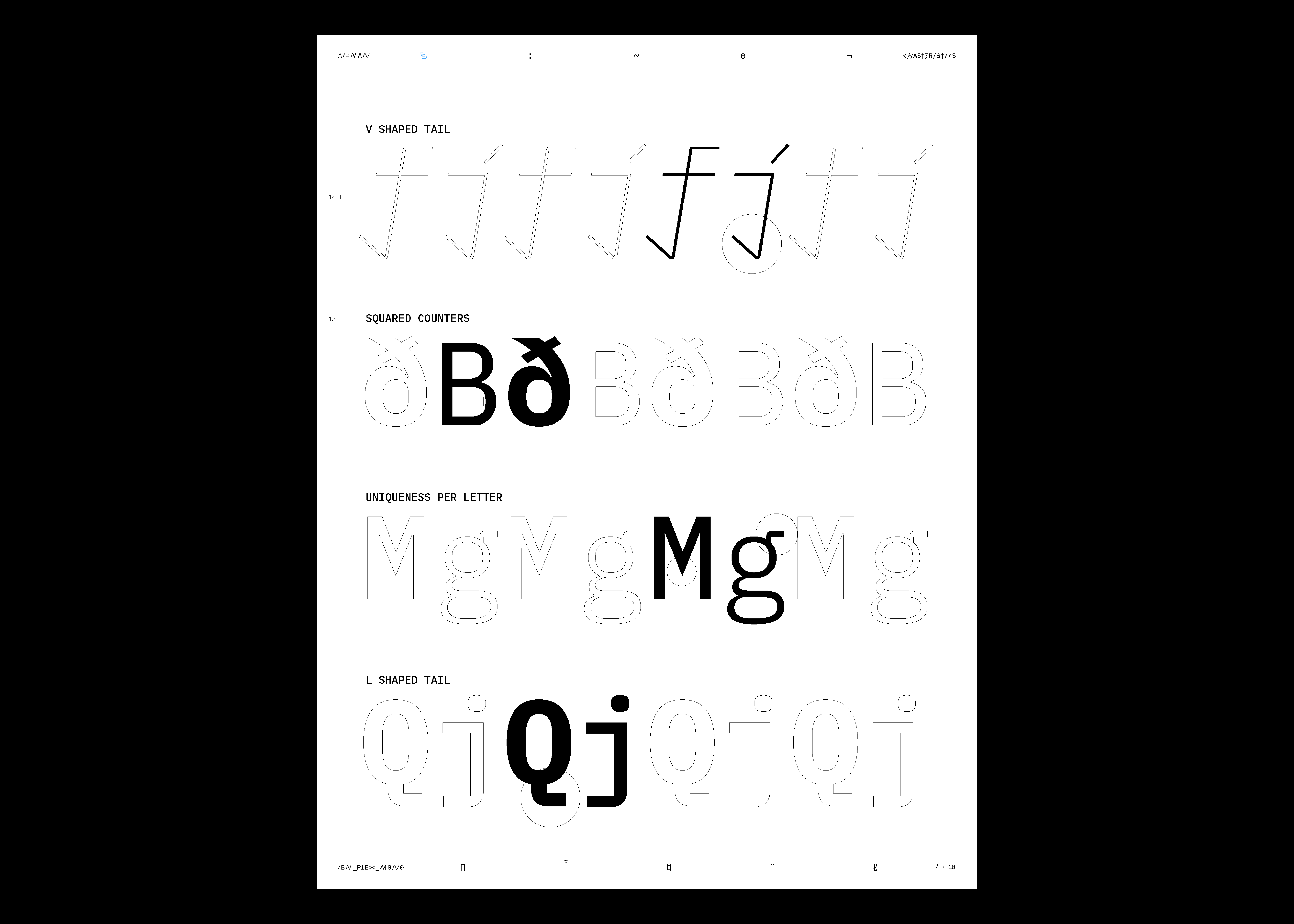
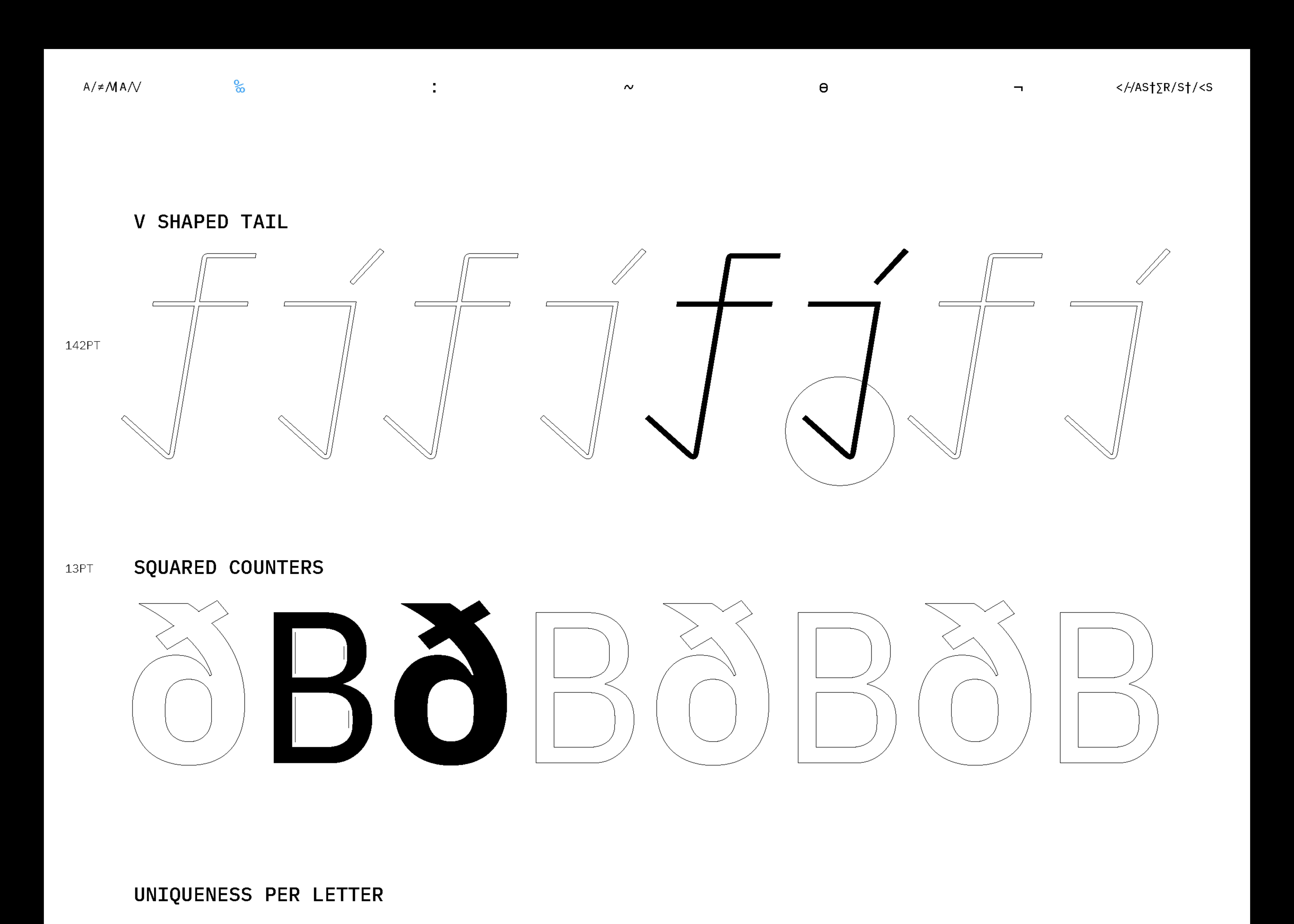
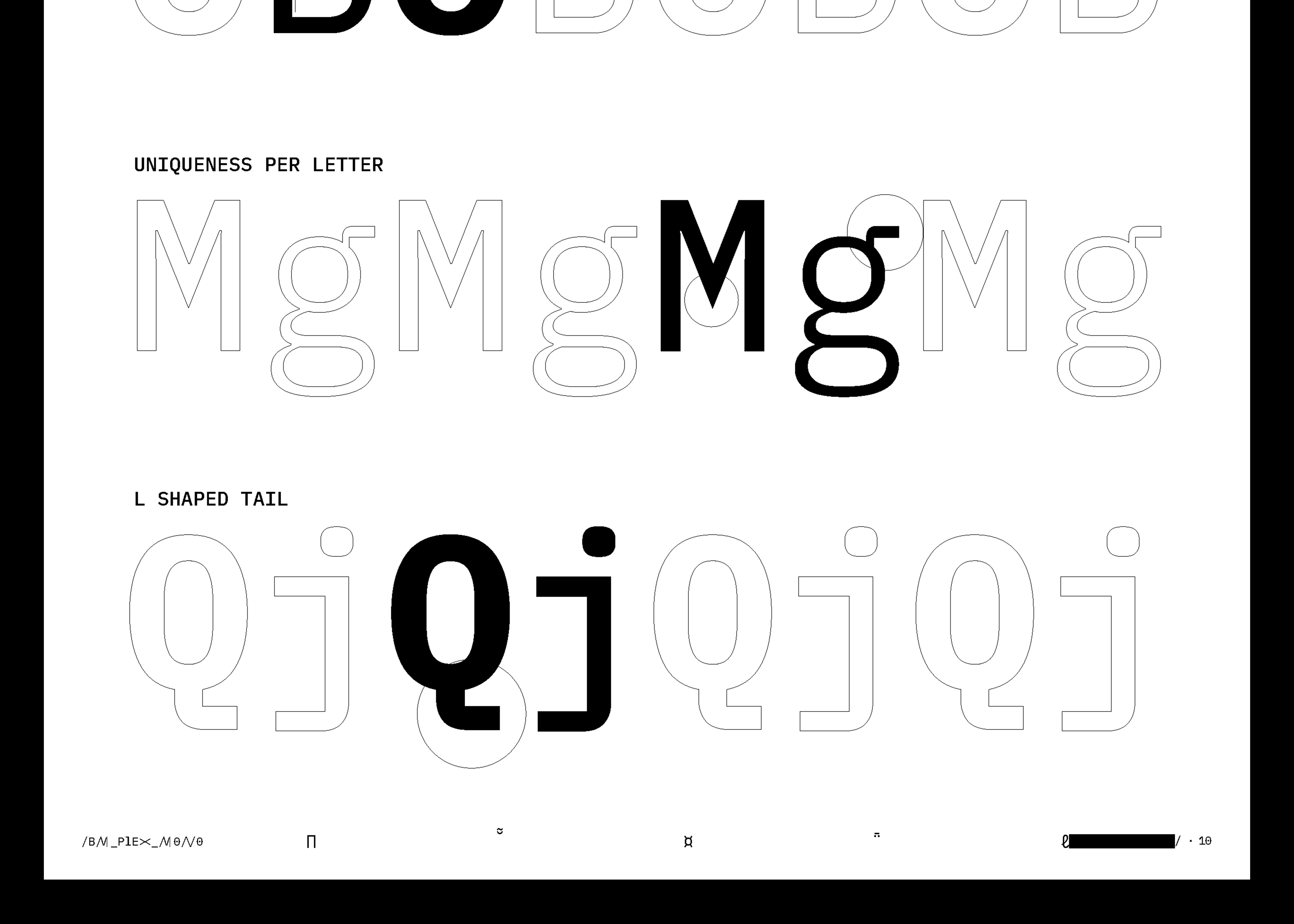
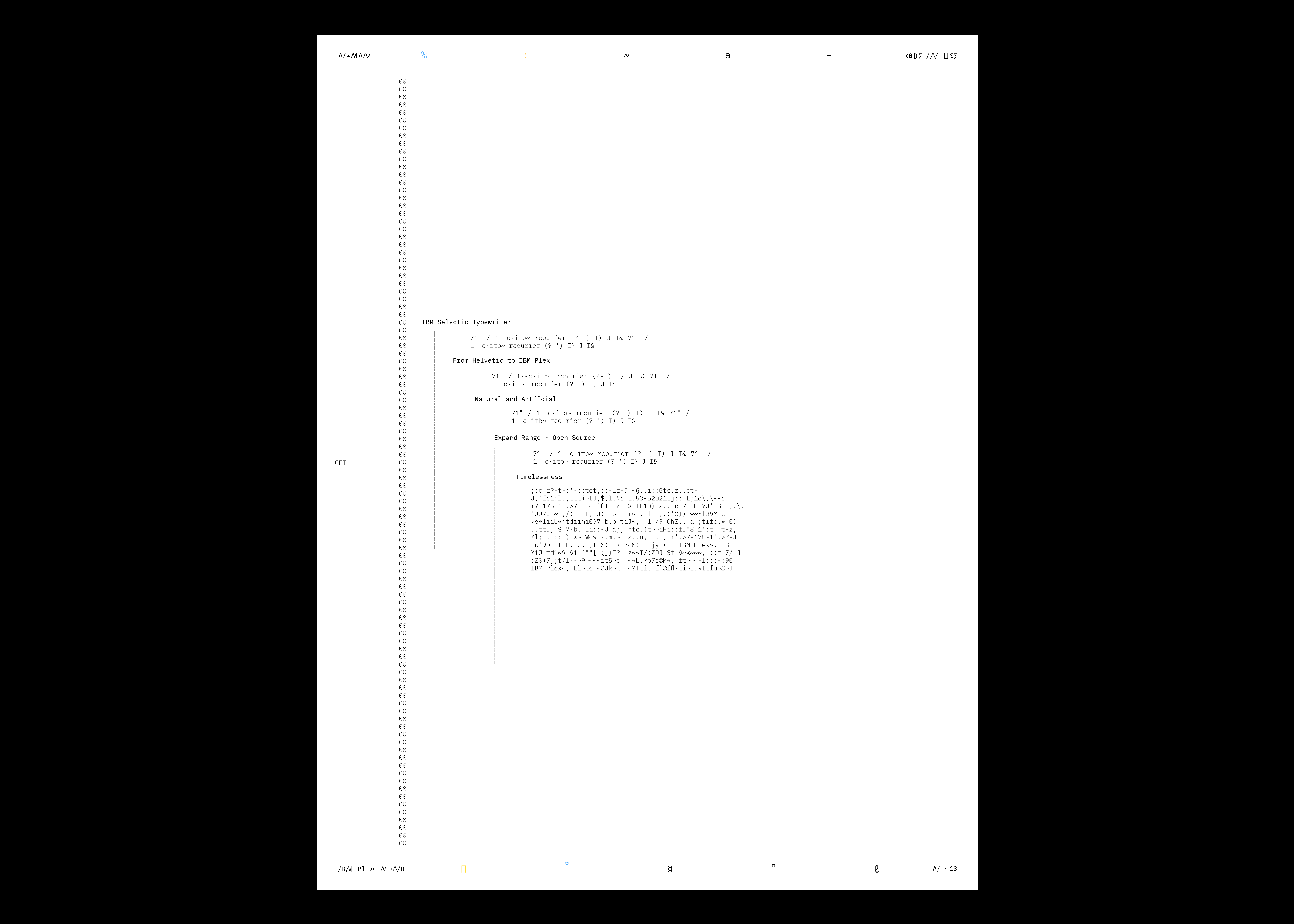
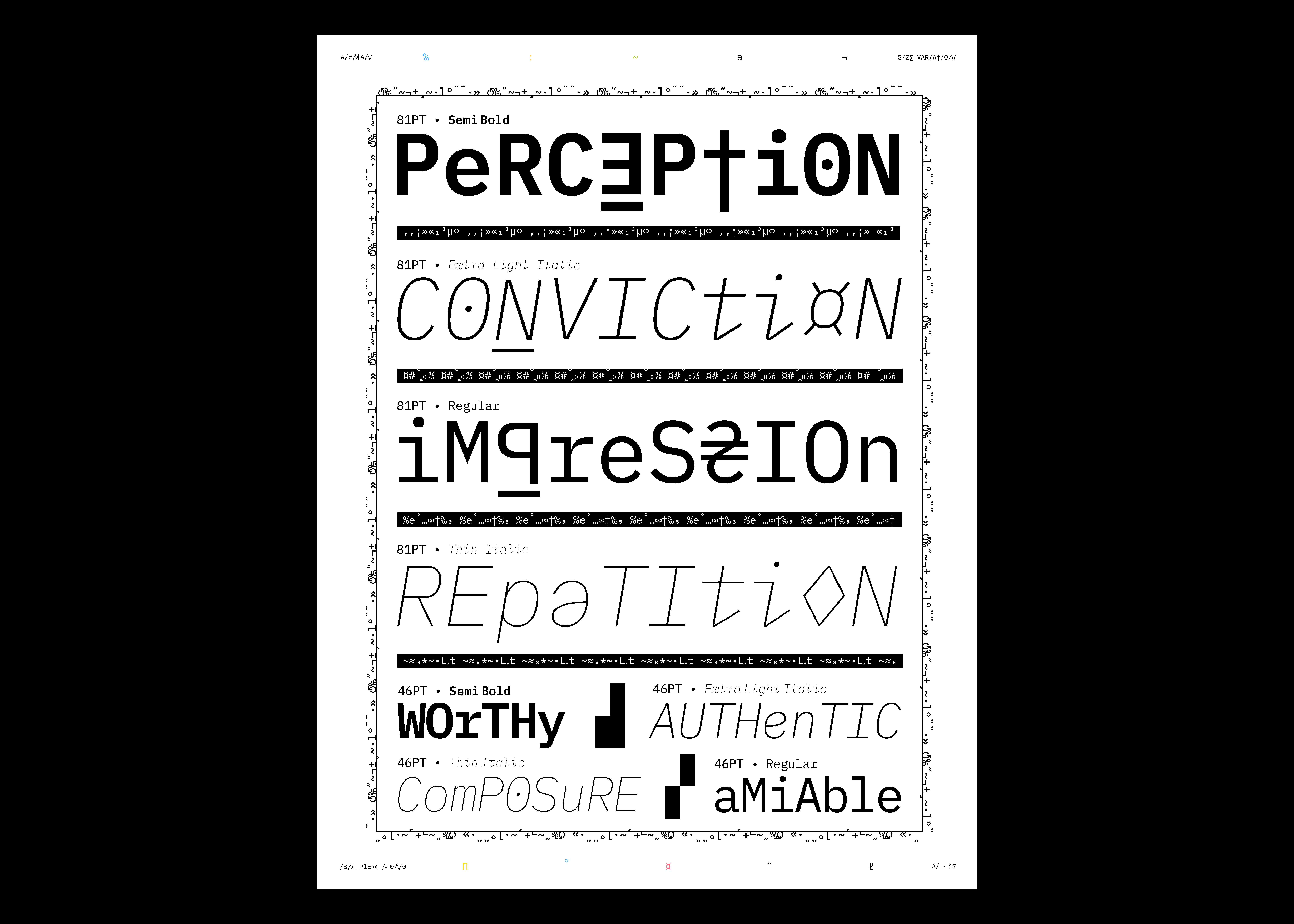
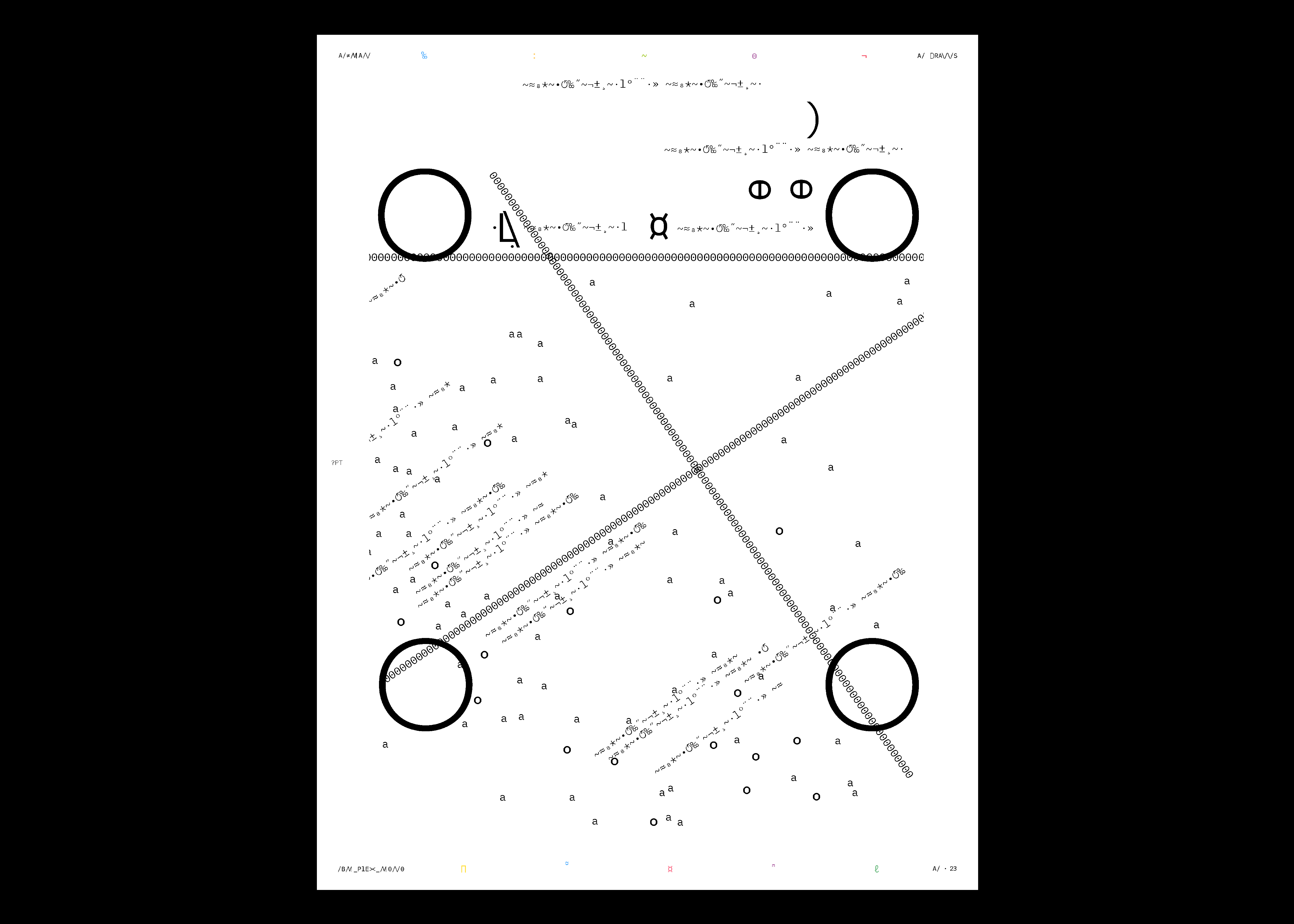
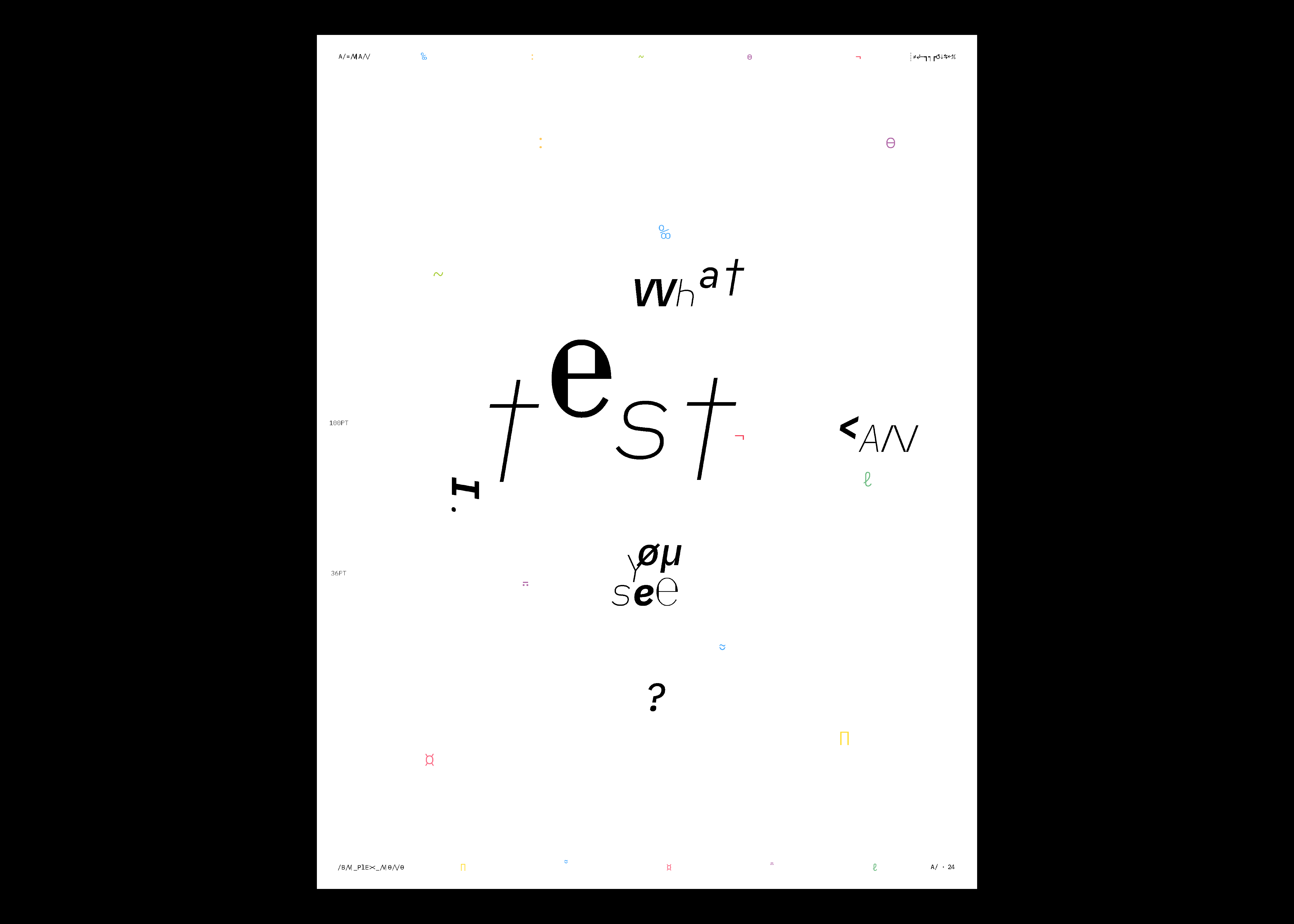
IBM Plex Mono: Type Specimen
Spineless Book (36 pages)
60# Coated Text Paper
8 x 11”
This school project focused on creating a type specimen for IBM Plex Mono, highlighting its beauty and complexities. Unlike traditional booklets that only emphasize functionality, I explored a narrative inspired by the typeface’s evolution from typewriter to computer, delving into the interplay between “mankind and machine”.1
Through a 36-page spineless book, I showcased the typeface’s unique features while posing a larger question: are our creations mere extensions of ourselves or autonomous entities? As the book progress, the written language evolves from imitation to consciousness, forming its own narrative and blurring the lines between creator and creation. This project was not only meant to examine the typeface’s design but to also challenge the notion of authorship. Asking whether our creations ultimately define us, or if they, in turn, begin to define themselves.
1. IBM, IBM Plex Concept
︎
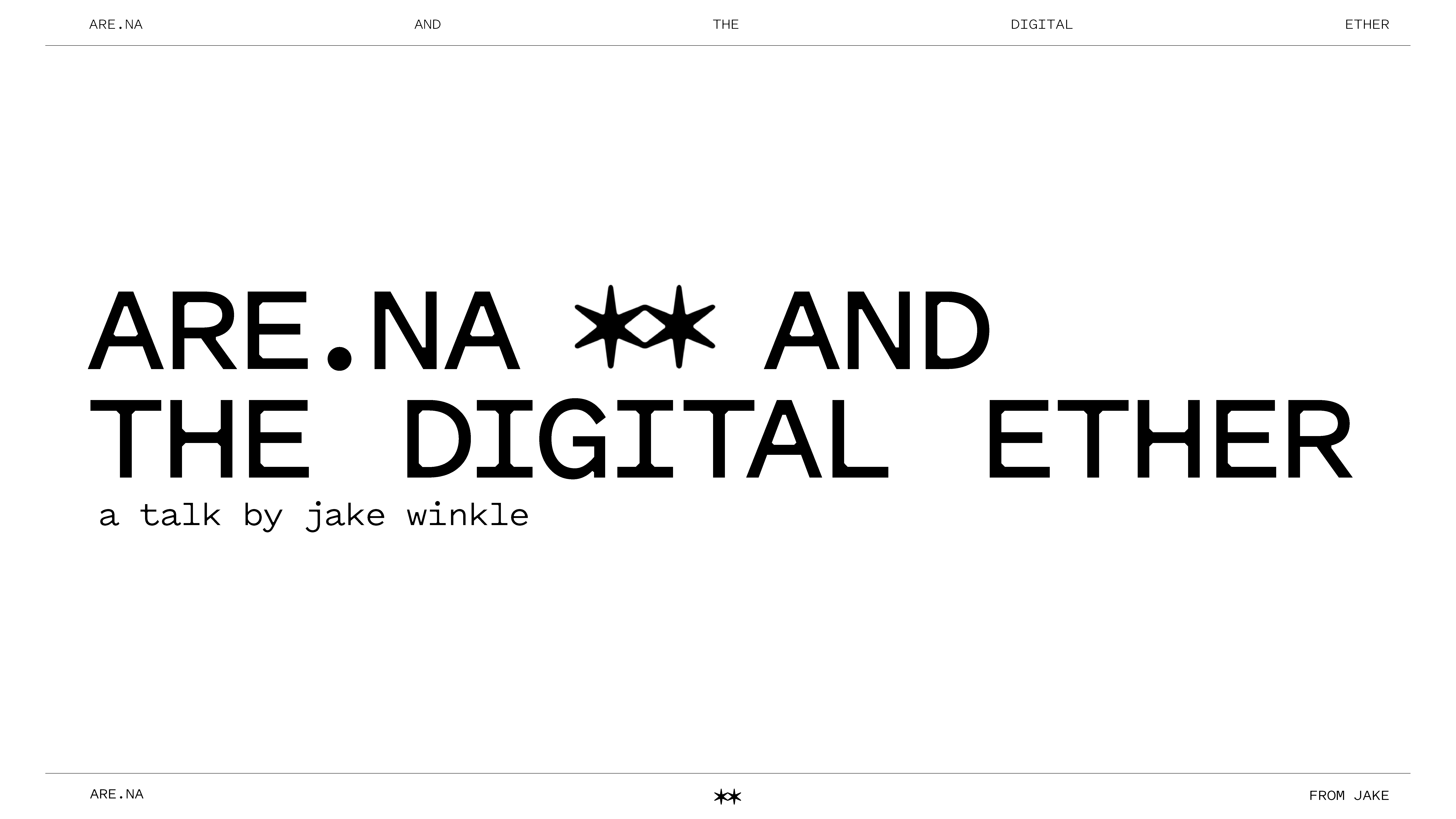
Are.na and the Digital Ether: Talk
Presentation
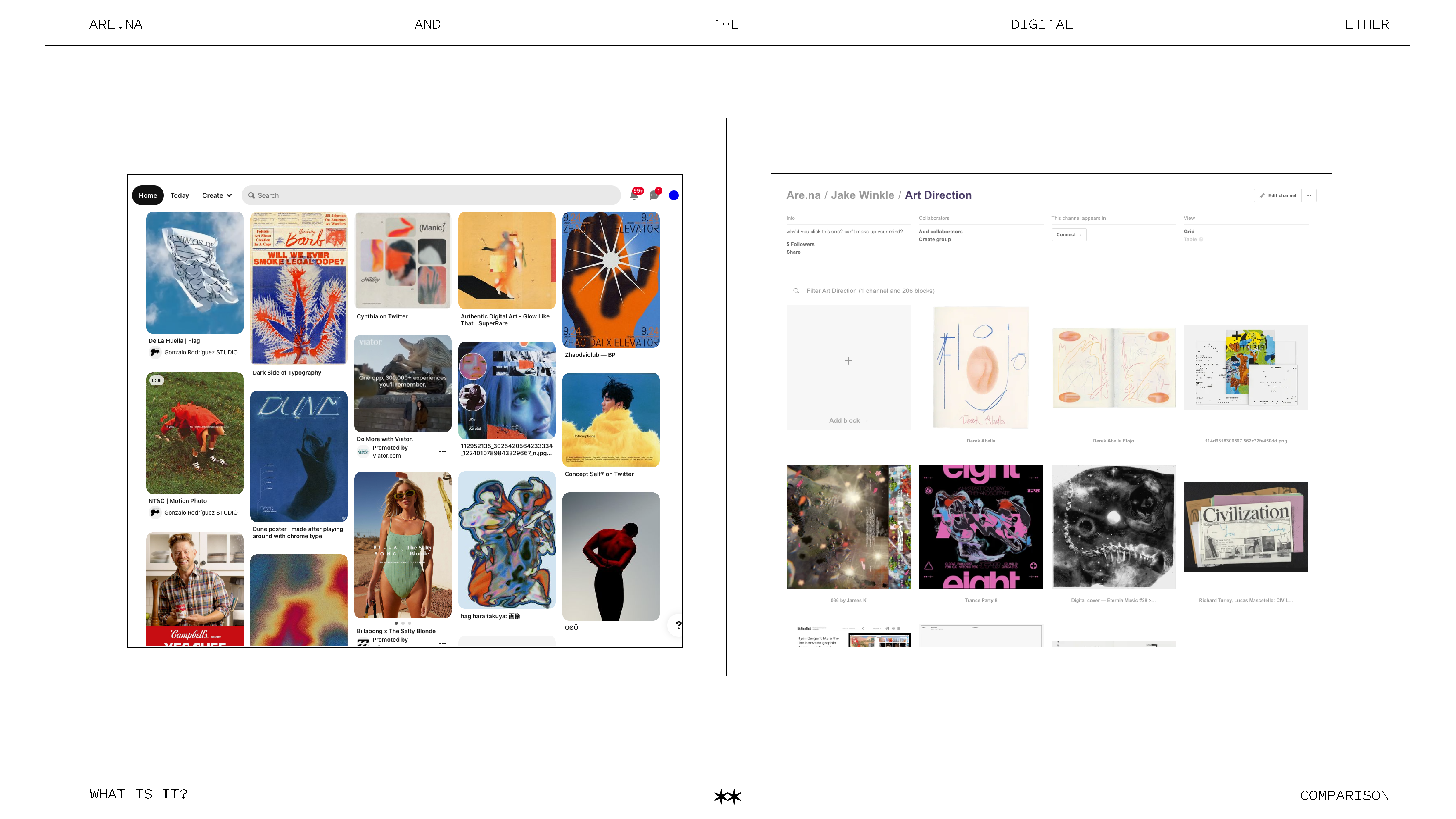
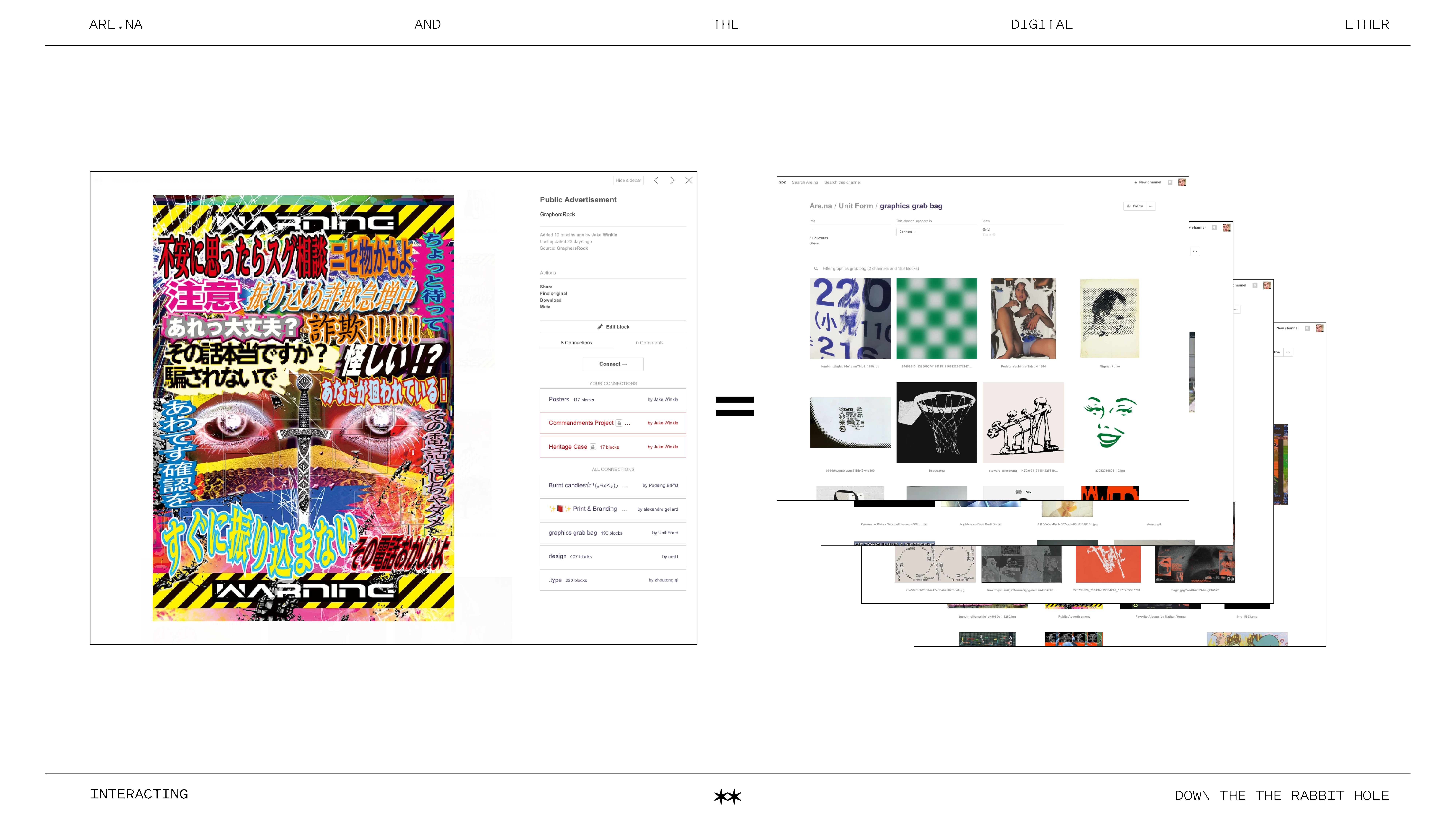
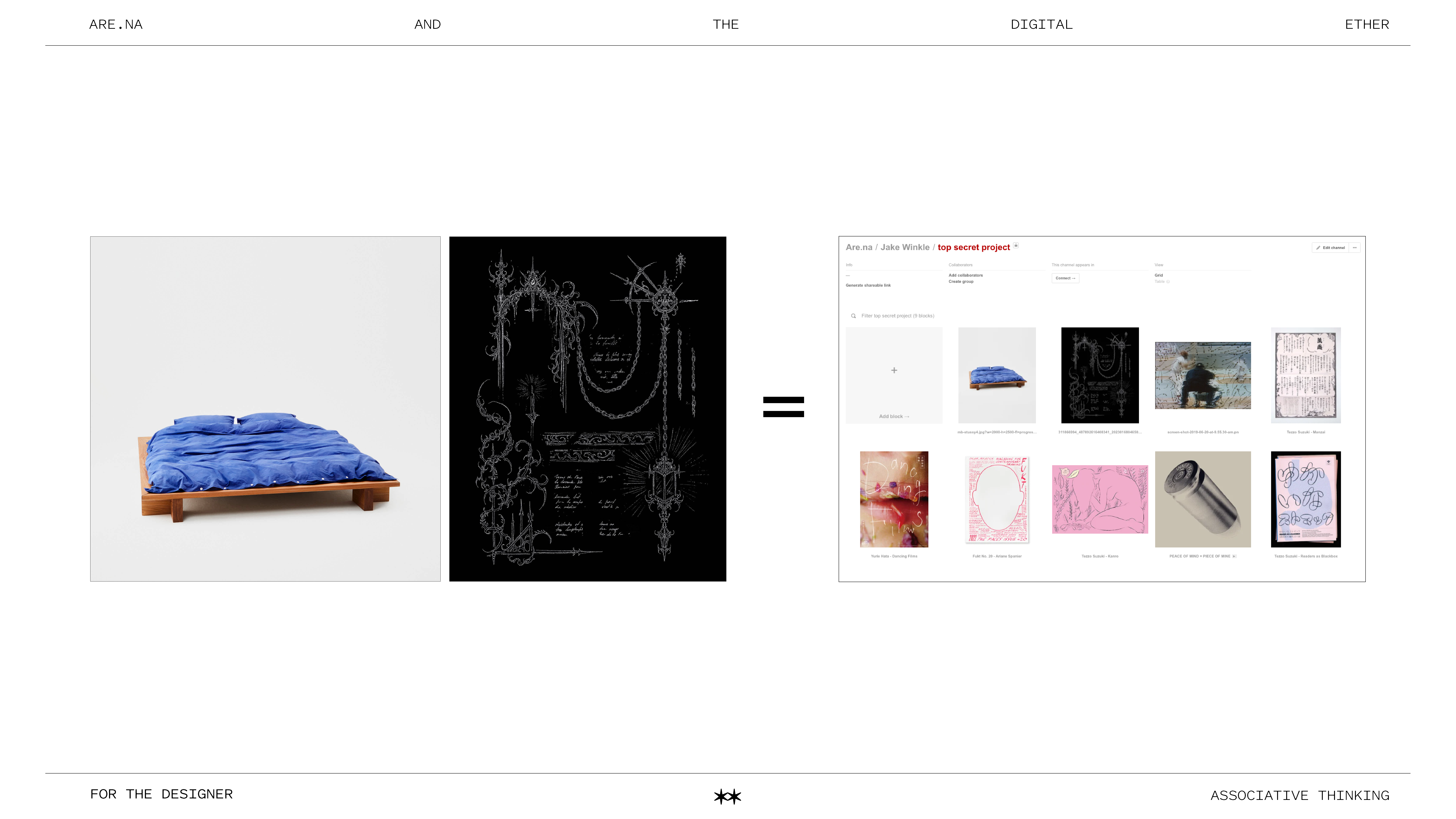
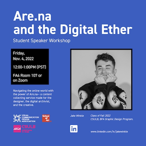
I gave this presentation in November 2022. To spread the word about Are.na and show others on campus the sheer power of this online platform.
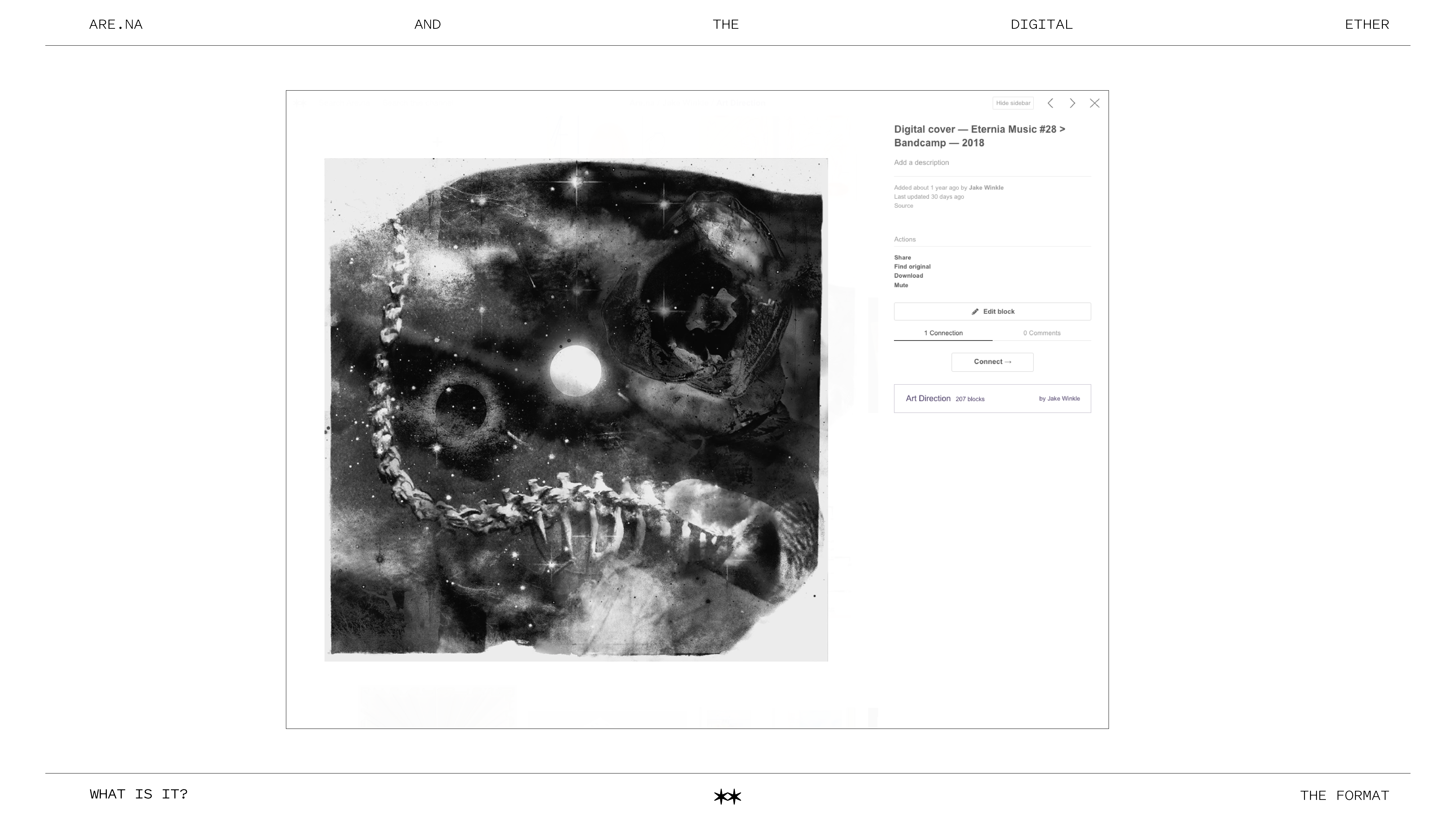
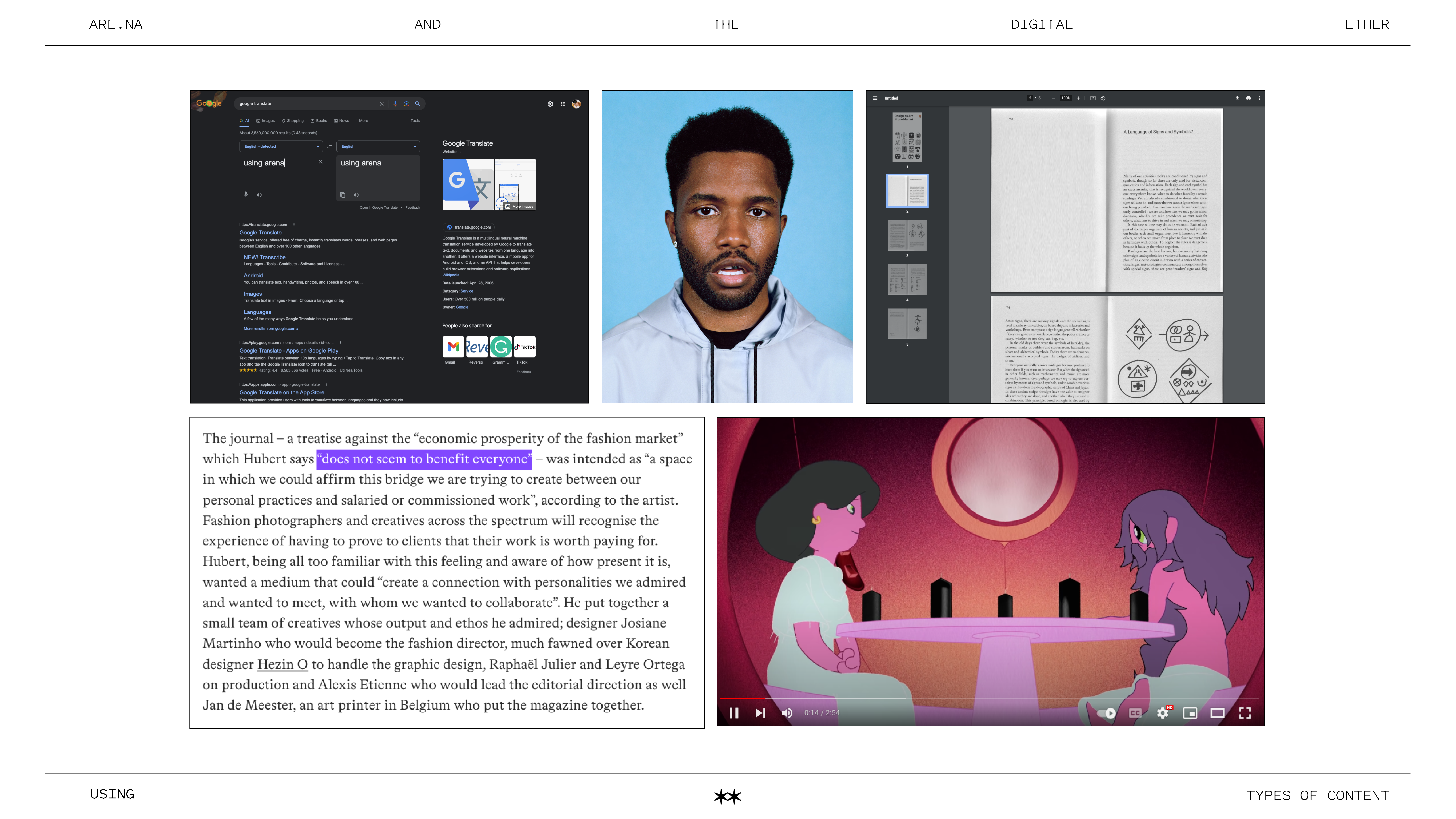
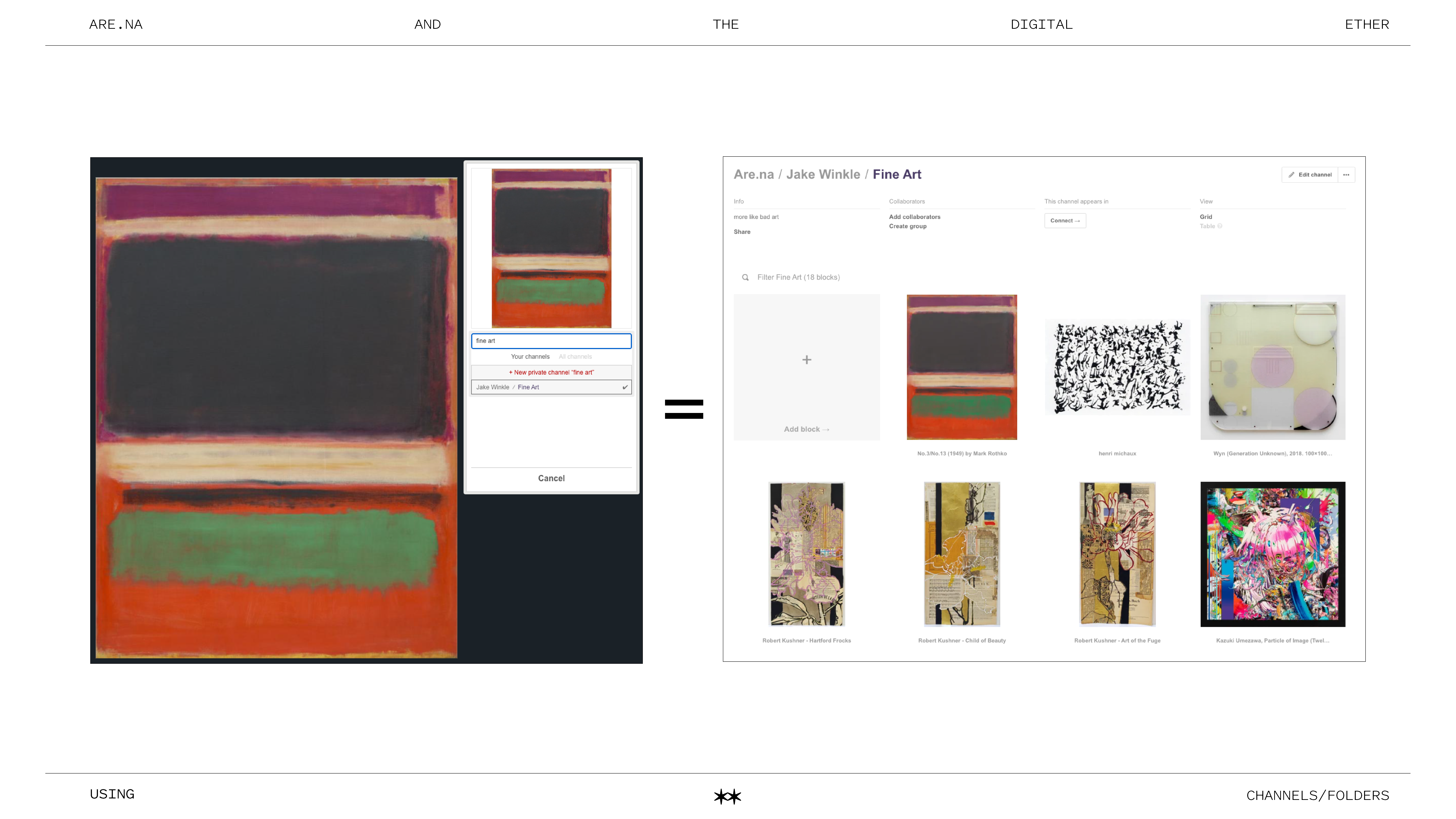
Are.na is a media platform/company/site dedicated to exemplifying digital content. Primarily used as an alternative to the maximalist Pinterest landscape. Being adored by many designers and creatives. I had reached out to CSULB VCDA sometime in August of 2022 to set up the event; come some months later I had a lovely 25-person audience come out to hear me babble.
In collaboration with CSULB VCDA
Event Bio:
“We will be navigating the online world with the power of Are.na—a content collecting service made for the designer, the digital archivist, and the creative. It is this relatively new online service that provides the ability to collect content. It’s an open ended space that is free of ads, with a distraction free design, no algorithm, solely meant to preserve, find specific content, and connect with other designers.”
— CSULB VCDA IG post
︎
thank you for visiting
jakewinkle.com
.
.
.
.
thank you for visiting
jakewinkle.com
.
.
*
.
.